• Blog
  • Shop
  • Podcast
  • Resources
  • About
  • Archive
  • Contact
  • Cart
  • Sign In My Account
Menu

The Gentleman Stationer

Vintage Living in the Modern World.
  • Blog
  • Shop
  • Podcast
  • Resources
  • About
  • Archive
  • Contact
  • Cart
  • Sign In My Account

Ink Review: Sailor Ink Studio 140

September 16, 2020

In Japan, Sailor holds "Studio” ink events, where you can have their master ink blenders custom blend a bottle of ink tailored to your preferences. Looking to further capitalize on the ink collecting craze, Sailor released 100 of these blends into the global market, and they hit U.S. retailers in 2019. I confess that I’m not as much of an ink obsessive as I used to be. Don’t get me wrong - I still have more ink than I will ever be able to use in my lifetime, but at some point when I see companies like Sailor and Colorverse releasing dozens of inks at a time, much less hundreds, I sort of throw up my hands and stop trying to keep track.

Some people are frustrated that Sailor moved to a smaller 20ml bottle while keeping the same pricing. Honestly, after thinking on it, the shift doesn’t bother me all that much. I’ve used maybe 3 or 4 full bottles of ink in my lifetime, and it’s probably less wasteful to purchase smaller bottles. Bringing this many different colors to market also increases production costs.

That said, the more pictures I saw of some of these Sailor Studio inks, the more they intrigued me, particularly the “double shaders,” a term that refers to inks that exhibit not just shading in terms of different tones of the same color, but different colors entirely. For example, Sailor Ink Studio 140 shown here has lavender undertones that emerge in a swab and when you write with a wetter nib.

You can see the shading, but the double-shading on this particular ink is more subtle and it didn’t photograph well. In person, you will see hints of light purple/lavender (even pink, maybe?) in the darker areas of the swab and handwriting sample.

The best thing about the Ink Studio lineup is that it’s reliable Sailor ink. Adding special properties such as sheen and shading (particularly sheen) can sometimes cause problems with ink failing to dry quickly and smearing. Not so much with Sailor, as I’ve had uniform success using any ink released by the company, and it has long been one of my favorite brands of ink to use in any pen.

The paper used for this ink review is Write Notepads Dot Grid Paper, which holds up beautifully to a wet ink swab and really shows off ink colors well.

Sailor Ink Studio 140, which is the ink pictured in this review, is a sky blue similar to Souten from the Jentle series, but perhaps a touch lighter. I had heard others remarking that some of the double-shading Studio inks can be very light, so I had some concerns that this one would be unusable for me. As it turns out, while No. 140 is light, it’s quite legible, and I had no issues using this for everyday writing, especially in a slightly wet Franklin-Christoph steel flex nib.

Takeaways and Where to Buy

As long as you’re not an “ink completionist” who feels compelled to sample every ink in a lineup, you can have a lot of fun with the Sailor Ink Studio lineup. Personally, I want to try a lot more of these “double shaders” like No. 140. The Studio Inks are sold in Sailor’s smaller, 20ml bottles priced at $18 each, and are available at site sponsor Goldspot, who provided this ink for review. Many thanks to Goldspot for making this review possible!

Disclaimer: This post contains links to paid sponsors and affiliates. Goldspot provided the bottle of ink featured in this review free of charge, for review purposes.

In Ink Reviews Tags Sailor Ink Studio, Sailor Ink Studio 140
Comment

Nakaya not included.

T.G.S. Exclusive Penwell Now Available!

September 15, 2020

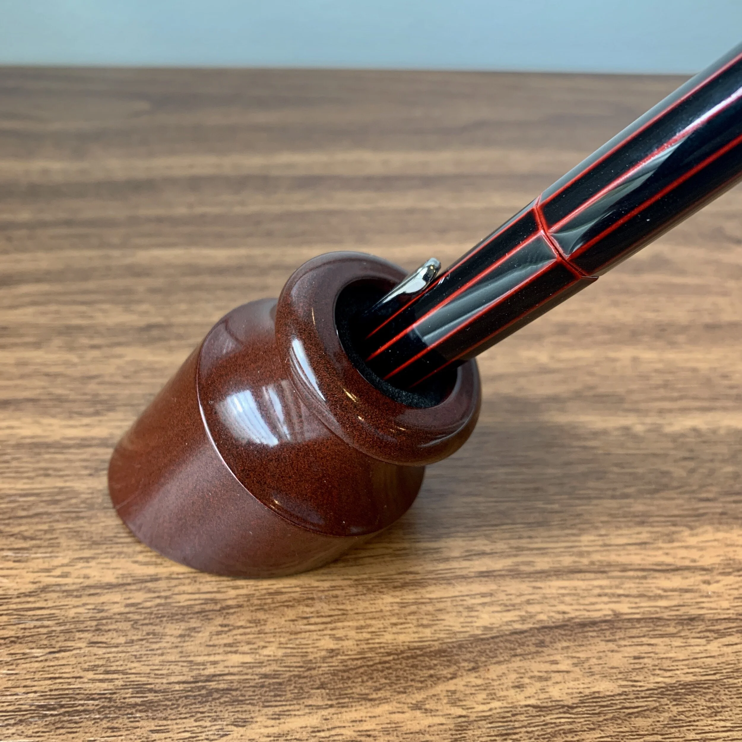
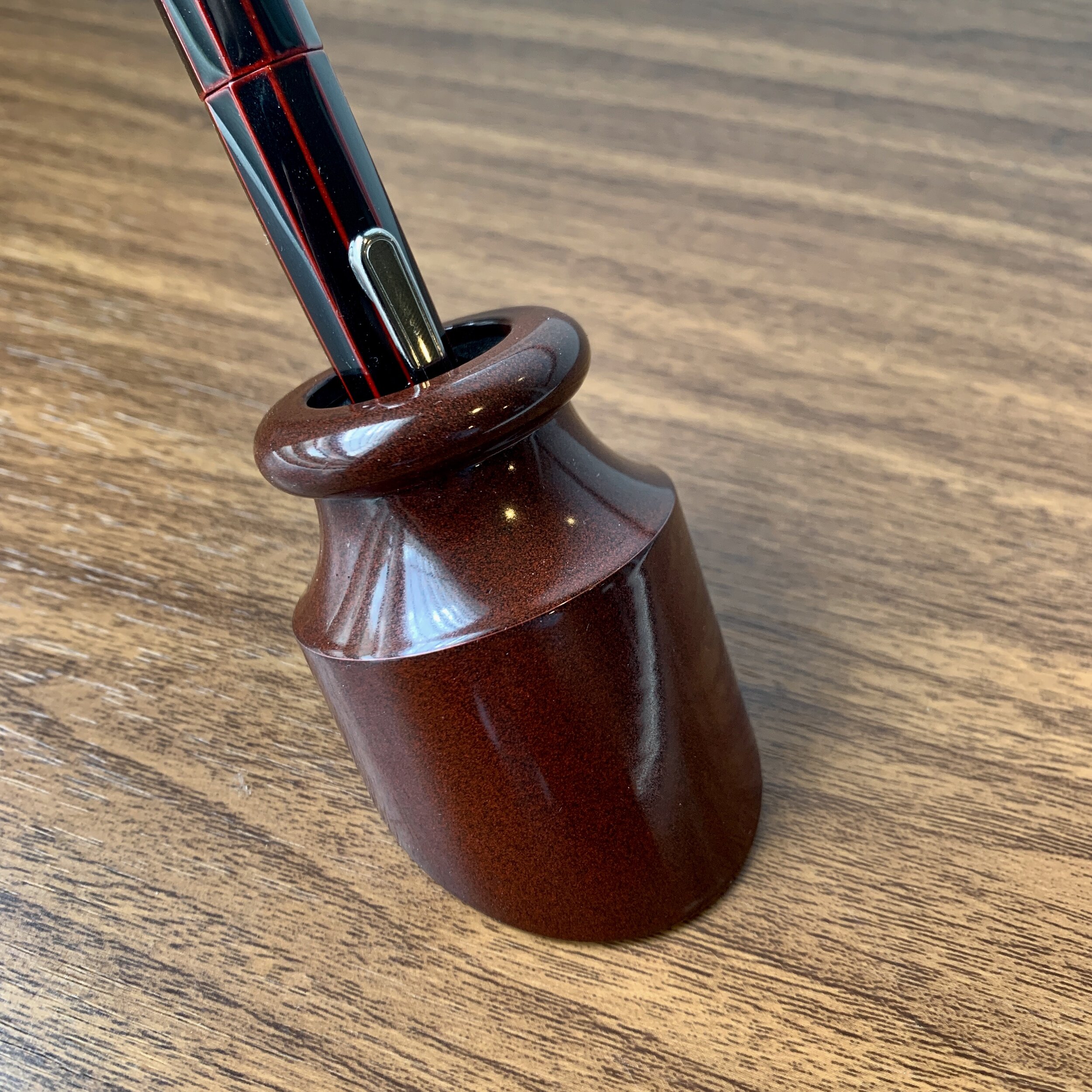
I’m proud to announce that my collaboration with Good Made Better is now available for purchase! This T.G.S.-exclusive edition Penwell features a unique “Aged Red” finish that draws its inspiration from the T.G.S. blog colors, burgundy and black. While these Penwells are powder-coated aluminum, as opposed to Urushi, I wanted to pick a finish that complements the look and depth of the dark red finish on my Nakaya Decapod. The subtle black and red grain on the Aged Red came out absolutely gorgeous.

If you’re unfamiliar with the Penwell, it’s one of my favorite fountain pen accessories that allows you to turn any pen into a desk pen. I have one on my desk at all times, and you can read my full write-up here.

These special edition Penwells are available in the T.G.S. Curated Shop, priced at $75. T.G.S. Patreon Supporters will receive special pricing, so if you are a Patreon member, please check your messages. All purchasers of the Penwell will receive a complimentary T.G.S. Bookmark from Good Made Better, and since these orders automatically qualify for free shipping, you can combine your order with other items from the Curated Shop. Since I just received a huge Write Notepads restock, you may want to stock up!

View fullsize T.G.S. Exclusive Penwell
View fullsize T.G.S. Exclusive Penwell Angle 2
In TGS Curated Shop Tags Penwell, TGS Curated Shop
1 Comment

My standing desk workstation, shown here, clockwise from top: a selection of pencils I’ve been using, M+R brass bullet sharpener, my Papier Plus clipboard with a Blackwing Illegal Pad, my stack of in-progress notebooks, and a Penwell (in forthcoming TGS-exclusive “Aged Red”).

Essential Office Supplies and Accessories for the Home Office

September 12, 2020

I’ve spent a lot of time (and I mean a LOT of time) thinking about optimizing my workspace now that I’m 97% remote, and it appears that things will remain that way even post-Covid. Previously, my home office basically served as dumping ground for household mail, hobby supplies, and whatever the dogs had dragged upstairs while I was at work. Now? It’s arguably a much more pleasant and productive place than my “real office” ever was. Most of this has involved basic decluttering and purchasing more functional shelving and storage, but I’ve also consolidated a lot of my desk accessories and office supplies, clearing some out and purchasing more functional replacements. I’m still working on bigger issues (such as choosing a better chair and hardwiring my home Wifi to ensure better speeds through the house), but I’m pleased with where things stand.

Continuing my prior discussions of home-based work, today’s post contains a mix of “gear recommendations” and discussion of general office layout choices that have worked for me. By way of background, my job involves approximately 80% writing, so my setup focuses on creating spaces conducive to reading, writing, and research, and having the tools I need for that readily at hand. Since everyone has different job requirements, these recommendations may or may not be on-point for you, but I do hope you find them helpful. So, with that in mind, what do I consider “essential”?

  1. WASD “Code” Mechanical Keyboard. Even though I work extensively by hand, the keyboard is still my primary input device. A mechanical keyboard, which features a mechanical switch for each key rather than a rubber dome or membrane, increases my typing accuracy and is much easier on my hands and wrists over longer sessions in front of a screen. Though I’ve owned multiple mechanical keyboards over the years, I’ve sold nearly all of them off in favor of WASD’s “Code” Keyboard, which combines understated basic black design with rock-solid durability. Since I prefer stiff, clicky keys, I use the version with Cherry MX Green switches.

  2. Landscape-Style Desk Pad. For years now, I’ve used a landscape-style desk pad or notebook on my desk beneath my keyboard for impromptu checklists, quick calculations, and drafting by hand. Typically, for notes that don’t get saved, I love the Baron Fig Mastermind desk pad. Lately, I’ve also used the Write Notepads lndscape-orientation spiral notebook, which is lined and therefore nice for drafting.

  3. Compact Pen or Tool Holder. Who would’ve thought that it’s distracting to have dozens of pens and pencils scattered all over your desk? I’ve tested out lots of pen holders, and my favorite remains my “Divide” from Dudek Modern goods, which holds a dozen pens and pencils in addition to pocket notebooks. That said, Mike only makes these in occasional batches, so you should also consider Galen Leather’s ToolComb, which I recently reviewed. I currently use both.

  4. Notepad or Tablet Stand. As a proponent of handwriting your first draft of pretty much anything, I do a lot of typing from hardcopy. While I’ve used more expensive aluminum tablet stands to hold notebooks and legal pads upright while I transcribe handwritten drafts, I discovered these simple and inexpensive folding metal book stands that are not only adjustable but fold flat for storage if you need to temporarily reclaim the desk space.

  5. Standing Desk. Moving around during the day is key to my own personal productivity (and it’s also healthier). My primary workspace is an extremely large, 1970s-era wooden desk (referred to in our house as “the battleship”) that I inherited from my grandfather, which allows me to spread out but will never win any awards for ergonomics or design. When I need a break, I use a podium-style adjustable desk from Levenger that is big enough to pull triple duty as a writing desk, laptop stand, and even a shipping station when I’m packing orders for the store. I love this thing so much that I’ve actually purchased two of them over the years, with a second currently sitting unused at my downtown office.

  6. Lap Desk or Clipboard. Another thing I’ve learned about myself is that I can’t go an entire day without going outside, though it’s easy to find yourself in that situation working from home if you don’t need to leave to get lunch, etc. I make an effort to go out on the porch or patio and work for at least an hour to get some air. I’ve experimented with a variety of lap desks, but I keep coming back to clipboards. I have a black canvas version I picked up years ago at Papier Plus in Paris, which I don’t believe they sell anymore. I recently found these Penco fiberboard versions in A4 size that also make a great mobile work surface.

  7. Dedicated Work/Personal Notebooks. Prior to 2020, I had started using a single large notebook for all of my notes to reduce the weight and bulk of what I had to carry back and forth between home and office. Now, I’m back to using three to four different notebooks to better separate my work life from my personal life (which is hard to do when worlds collide).

  8. Desktop Pencil Sharpener. I’ve found myself using more and more graphite for work purposes. While I still use my fountain pens to journal and when I’m otherwise writing for my own enjoyment, pencil can be less distracting since I find myself focusing on the actual work as opposed to the ink, paper, nib, etc. My go-to all-purpose pencil sharpener remains the Carl Angel-5/Classroom Friendly pencil sharpener, with the handheld M+R Brass Bullet taking on an increasingly prominent role when I’m working on the porch.

  9. Whiteboard/Chalkboard. For planning and sketching out ideas free-form, and for making running lists of tasks in a place where I can see them, sometimes there’s nothing better than a wall board. I say “wall board” because I’m seriously considering moving away from a whiteboard to a traditional chalkboard. It can be hard to clean a whiteboard, and even the “low odor” markers give me a headache. Plus, if I really want to go all “mad scientist,” I could paint an entire wall of my office in chalkboard paint and…. well, you get the idea.

  10. Annotation/Highlighter Pencils. I dislike liquid ink highlighters, especially for marking up handwritten notes. They smear everything from ink to pencils. I much prefer highlighter pencils, and for years I’ve used these Caran d’Ache Graphicolor highlighter/graphite combination pencils. I also enjoy the Graphicolor red/graphite annotation pencils, which form a key part of my reading and journaling kit.

What home office items do you find indispensable to your daily work? I’m interested to hear! Please feel free to leave a comment or message me directly using the “Contact” link!

This post contains no affiliate links, thought it may contain links to past reviews on the blog and a handful of items in The T.G.S. Curated Shop.
In Editorial Tags Working from Home, Editorial
4 Comments

Everyday Writing with a Modern Flex Pen

September 9, 2020

I’ve always been a “firm nib” person for the majority of my everyday writing. While I enjoy flexible nib fountain pens, my experience has been limited to the occasional review and playing around with vintage flex after-hours at pen shows. I use a combination of italic-style script and cursive for my everyday writing, so firmer nibs typically work better for my handwriting, particularly cursive italics and stubs.

But I’m still intrigued by the new “flex” nibs pen companies have been releasing over the past few years. I use the term “flex” loosely - in my opinion, there is no such thing as a modern equivalent of true “vintage flex” like you would find in a vintage Waterman pen from the first half of the 20th century. What you have today, rather, are softer nibs that can provide a fair bit of line variation if pushed, but you need to be careful and manage your expectations.

Both of these nibs are No. 6 JoWo. The one on the left is a 14k fine nib custom engraved for Montegrappa, with carve-outs on the side to increase flexibility. The one on the right is a Franklin-Christoph stainless steel nib with an elongated nib slit, which also increases the ability to flex the tines.

For today’s post, I’m not so much interested in further discussion of “whether these nibs are truly flex nibs.” Each person tends to have their own opinion on that issue, influenced mainly by how much line variation they like in their writing and whether they have experience in the vintage market. I’m more curious about the practicality of these softer nibs and whether or not I can actually use one as a daily driver. Will I spring the nib? Will the pen write too wet, creating a feathering, bleeding mess? Given that I don’t write in pure cursive, will I even be able to notice a difference?

Review Pen No. 1: A Montegrappa Miya 450 with a 14k Fine Flex.

Review Pen No. 2: A Newton Shinobi with a Franklin-Christoph HPSteel Flex Extra-fine nib unit.

For this experiment I chose two pens that sit on the firmer end of the flexibility scale: a Montegrappa Miya 450 with Montegrappa’s 14k “fine flex,” and my Newton Shinobi with Franklin-Christoph’s HP Steel Flex nib. I picked both up at pen shows earlier this year before everything shut down. As it turns out, I’ve enjoyed using these pens, including as daily writers, though I would advise anyone interested in these pens to take a few things into consideration:

  • Use a lighter hand. Not only will this create more noticeable line variation, but you’ll avoid springing the tines. Less writing pressure will also result in less ink being poured onto the page - a key consideration if you need to take notes or do a lot of other writing where you need the ink to dry quickly. If, like me, you tend to use a fair bit of pressure when you write, consider a drier steel flex nib. I’m still getting the hang of writing with the Montegrappa 14k flex, and the Franklin-Christoph steel nib offered a more seamless transition for my writing style.

  • Pay attention to your paper. Because softer nibs tend to lay more ink on the page (especially gold nibs), you will likely experience feathering and bleedthrough on cheaper and/or more absorbent paper. The writing samples for this review were done in a Write Notepads Dot Grid Spiral, which performed beautifully. Other paper options include Tomoe River and Clairefontaine. I’ve had mixed results on Rhodia with super-wet pens, and sometimes get spots of bleeding.

  • Pay attention to your ink. While you might be tempted to use more flexible nibs to show off your highly saturated “super sheeners” and “super shaders,” be aware that these inks might not be the best choice for everyday writing in a super wet pen. If you plan on using the pen for notetaking or office work, consider an ink that dries relatively quickly and is known to behave well. Sailor and Montblanc make excellent inks, and the two used for this post (Montblanc Irish Green and Sailor Ink Studio 140) worked quite well, without complications.

Takeaways and Final Thoughts

So could I see myself using either of these nibs as a regular everyday writer over the long haul? Yes and no. Since it takes more pressure to flex the nib, the Franklin-Christoph HP Steel Flex nib writes like a slightly softer, standard extra-fine JoWo steel nib that has the option to add line variation if you so desire. I could easily use this particular nib all day, every day, and it may have found a permanent home in my Newton Shinobi. While I enjoy the 14k “fine flex” nib in the Miya, it’s still slightly too wet for me to use as an everyday work pen. I typically have to take notes quickly which doesn’t allow enough time for the ink to dry before I need to turn the page. For me, the Miya will mainly be used for personal writing in my journal.

I acquired the pens featured in this review directly from Kenro (the U.S. Montegrappa distributor), and from Franklin-Christoph. Kenro provided me with the Miya as part of their generous sponsorship of The Gentleman Stationer; the Franklin-Christoph was acquired with my own funds for my own collection. This post contains links to paid sponsors and affliates.

In Pens, Editorial Tags Flex Nib, Montegrappa Flex, Franklin-Christoph Steel Flex, Newton Pens
1 Comment

First Impressions: Esterbrook JR Pocket Pen in Tuxedo Black

September 5, 2020

This week, Esterbrook announced arguably its biggest release to date: the “JR Pocket Pen”, which is the first modern Esterbrook that actually attempts to replicate the design of the famed vintage “J” pen. As such, Esterbrook knew that there would be heavy expectations piled on this release, and there was no room for error. So how did they do?

While I’ve only had the pen for a week, what I’ve seen so far leads me to believe that the JR will be widely viewed as a success. As with all “heritage” releases - which is how I generally refer to products such as pens and watches that draw inspiration from a vintage product without copying it exactly - the JR borrows from those aspects of the original “J” that translate best into a modern fountain pen, and dispenses with others that, well, wouldn’t work so well today. I’ll briefly run through the similarities and differences:

The Esterbrook JR comes in three different colors: Tuxedo Black (shown here), Carmine Red, and Capri Blue (which is the only one with gold trim). Based on pictures alone, the Tuxedo Black and Capri Blue are my favorites.

First of All, What’s Changed?

  • The new Esterbrook JR is slightly slimmer than a standard vintage Esterbrook J, and the barrel and ends less rounded. While I don’t currently have any vintage Esterbrooks in my collection, Ana over at the Well-Appointed Desk has published her own review and has some extremely thorough comparison photos that show the JR compared against various vintage Esterbrook fountain pens.

  • Esterbrook has dispensed with the black plastic cap jewels in favor of metal finials. The finial on the cap bears the Esterbrook “infinity” logo also found on the Camden. While the black plastic finials lent the original J a unique, almost Art Deco look, they also grew fragile over time and had a tendency to crack and/or fall out if you accidentally dropped the pen. Here, I would say that gains in long-term durability make up for any losses in terms of aesthetics and faithfulness to the original design.

  • The filling system on the JR, predictably, is cartridge-converter instead of a lever-filler. I’m sure many vintage pen die-hards will complain (loudly) about this fact, but seriously, is Esterbrook really going to release a lever-filling fountain pen that would require periodic ink sac replacement? No. Nor should they. Even back in its heyday, Esterbrook was a mass-market brand, and to me, going with cartridge-converter is more faithful to the original vision of Esterbrook than releasing a throwback pen with a high-maintenance lever-filling system.

Size comparison, show here between a Kokuyo Sketch Notebook (left) and a Hobonichi Techo A6. Writing samples in this review are shown in the Kokuyo Sketch.

What’s the Same or Similar?

  • The overall look, feel, and aesthetic of the pen are very similar. As someone who has used vintage Esterbrooks extensively, I will say that the modern iteration of the company has definitely managed to “recapture the magic” of the original brand. A key part of this reissue is the choice of pearlescent acrylic: Vintage Esterbrooks are known for the depth of the material used to make the barrels, which was largely unique to that brand. The black, blue, and red materials chosen for the JR, while not an exact match, replicates at least some of that same depth.

  • While slightly longer and slimmer than the clip on the original J, the clip on the JR retains the same ribbed look while omitting the “Esterbrook” engraving, which moves to the cap band. While I’m glad they retained some version of the classic clip, I’m torn over the placement of the engraving. Could they have gone with a wider clip and kept the vintage-style engraving? Possibly, but I suspect this would present production issues, whereas placing the Esterbrook engraving on the cap band also creates branding consistency with the Estie and the Camden.

  • The JR features an interchangeable stainless steel JoWo No. 5 nib unit, which allows you to swap in different nib sizes, and even JoWo nib units you may have had ground to a stub, italic, architect, etc. It remains to be seen whether the JR will get its own adapter that will allow you to use the full array of vintage Esterbrook nib units.

Esterbrook is marketing the JR as a “pocket pen.” I typically don’t pocket-carry pens like this one - it’s slightly too large for that purpose, at least for me - but it’s quite portable. The JR would make a great planner pen. (Picture below)

Perhaps my one critique of this pen is that I wish the cap posted a touch deeper as it looks a little awkward. The pen itself is so light, however, that it makes very little difference from a functionality perspective.

No surprises with the line written by a medium No. 5 JoWo nib.

Takeaways and Where to Buy

The Esterbrook JR is a very well done heritage pen that I expect will please the majority of Esterbrook fans while still managing to tick off those few who would only be pleased with a “J” replica. As evidenced by the visceral reaction to Parker’s recently announced Parker 51 re-release, attempting to recreate a vintage pen design for modern users can be a risky move, in that you need to strike a balance between catering to fans of the original pen while still making a product that is marketable to new customers. So far, Esterbrook seems to have done just that, and I’m excited to see where they take this pen design over the next year or so. The next logical step would be to introduce additional colors, either special editions or green and grey pens to match the original lineup, as well as a vintage nib adapter.

You should now be able to purchase the Esterbrook JR at most Esterbrook retailers, including site sponsors Vanness Pens and Goldspot. Current MSRP on the Esterbrook JR is $175, with most retailers so far pricing this pen at $140, which is becoming the standard price point for a steel-nib pen of this quality.

The Esterbrook JR fits perfectly in the pen slots on my Hobonichi Techo. Planner pen, anyone?

Disclaimer: Many thanks to Esterbrook/Kenro Industries for sending me this pen for review. This post contains links to paid sponsors/affiliates.

In Pens Tags Esterbrook, Esterbrook JR
6 Comments
← Newer Posts Older Posts →
Store Hours and Events
Shop T.G.S. Online
Updated 2026 "Best Pens" Guide
No results found
On The Paper Trail: Live In Nashville Event Tickets Now Available!
TGS_25 Roterfaden Restock Notification
Hierarchies of Fountain Pen Friendly Paper

Join Our Patreon!
Subscribe to the TGS E-mail List

Featured Posts

Featured
Everyday-Stationery-Bags
July 25, 2026
What's the Best Everyday Stationery Bag? My Own Considerations and 5 Options for Pen Show Season
July 25, 2026
Read more →
July 25, 2026
Graphilo-Kobeha-Paper.jpg
July 11, 2026
Paper Review: Graphilo by Kobeha
July 11, 2026
Read more →
July 11, 2026
Pilot-Custom-Heritage-92.jpg
June 6, 2026
Workhorse Pens: Pilot Custom Heritage 92 Fountain Pen
June 6, 2026
Read more →
June 6, 2026
The Gentleman Stationer RSS

View Cart

© Digital Divide Media, LLC, 2014-present.

All content is the exclusive property of Digital Divide Media, LLC, d/b/a The Gentleman Stationer, including “The Gentleman Stationer” website and trademark, and should not be reproduced without express written permission.  All rights reserved.

All content containing paid advertising, affiliate links, or sponsored content will be plainly disclosed by a disclaimer when/if featured.

Contact Information

Website Terms and Conditions

Store Shipping Policy and Return Policy

Privacy Policy and Cookie Policy

Accessibility Statement

Powered by Squarespace