• Blog
  • Shop
  • Podcast
  • Resources
  • Archive
  • FAQ
  • About
  • Contact
  • Sign In My Account
Menu

The Gentleman Stationer

  • Blog
  • Shop
  • Podcast
  • Resources
  • Archive
  • FAQ
  • About
  • Contact
  • Sign In My Account

Recommended Analogue-Inspired Books to Read While You're Shut In

March 18, 2020

There’s no dispute that these are scary times: If it’s not the Coronavirus, it’s the economic fallout from the Coronavirus, or even whether you’ll be able to purchase toilet paper during your next Costco run. Compounding the anxiety, at least for me, is the fact that I can’t actually do anything about any of them, so I fall back on what I’ve always used to distract myself: books, pens, and paper. I don’t discuss reading much on this blog, even though it’s been important part of my life for much longer than pens, and I imagine there’s substantial overlap between avid readers and stationery aficionados. Personally, I’m going to be relying pretty heavily on my backlog of books - and after that, my Kindle - to get me through the next four to six weeks. I thought I’d share some recommendations for books I’ve enjoyed, all of which have some sort of tie to the main themes underlying this blog.

Disclaimer: This post contains affiliate links, from which I may earn a small commission based on purchases made from this post. It’s one of many ways I financially support the blog.

  1. Digital Minimalism, by Cal Newport. What better time than now to practice “digital minimalism” and reap the mental health benefits of not being online 24-7? Especially now that many of us are telecommuting or have alternative work arrangements, it’s more important than ever to carve out digital down time and set appropriate boundaries.

  2. The Revenge of Analog, by David Sax. I’ve recommended this book before, but what better time to rediscover things like board games, vinyl records, stationery, and, well, books, than during a period of time when you can’t go to work and you can’t leave your house?

  3. Daily Rituals: How Artists Work, by Mason Currey. My own job has gradually transitioned to a remote working arrangement, so the past couple of weeks haven’t been as much of a shock to the system as it’s possibly been for others. One thing that I’ve found extremely helpful is reading about how others have developed working routines (“rituals”) to keep them on task when they’re alone and have large amounts of unstructured time.

  4. Quiet: The Power of Introverts in a World That Can’t Stop Talking, by Susan Cain. I first read this book when it was released in 2012 and I’m re-reading this week. I’m actually enjoying it just as much, if not more, the second time around, as the themes of the book have only grown more relevant as our society continues to embrace the “extrovert ideal.” It’s also struck me that introverts may be particularly well-equipped to handle the prolonged shutdown most of us are facing,

  5. The Daily Stoic: 366 Meditations on Wisdom, Perseverance, and the Art of Living, by Ryan Holiday & Stephen Hanselman. Let’s mix in some philosophy here. I’ve had this book on my shelf for a year or so after purchasing it on a recommendation, but didn’t actually start reading it regularly until Mary Collis published this piece over at her blog, “From the Pen Cup.” I’m not sure that I’m a full-on adherent of Stoicism, at least not yet, but there’s definitely a lot to take away from this book, especially in turbulent times.

  6. Kafka on the Shore, by Haruki Murakami. I’ve become a huge fan of Murakami recently, and if you’re a fan of dense books that you can read multiple times and take away something new every time, this one’s a great one. Bonus: Murakami’s novels are peppered with references to pens, pencils, books, and libraries, all of which subtly play key roles in the story. For a shorter, less dense read, you could also start with Sputnik Sweetheart.

Happy reading, and take care of yourselves. I’m also looking for reading recommendations, as I’m starting to go a bit stir crazy being shut inside with a 6-year old, so feel free to add to this list in the comments!
In Books, Top 5 Tags Books, Reading Recommendations
1 Comment

Pen Review: Leonardo Furore with Rose Gold Trim

March 15, 2020

Today’s review looks at the “Furore” fountain pen from Leonardo Officina Italiana, the penmakers based in Naples, Italy who have exploded in popularity over the past two years. Their Momento Zero and Momento Zero Grande are some of my favorite fountain pens on the market right now, and the “Furore” is their first attempt at a new shape that, to date, has received less attention than the Momento Zero but presents an equally excellent value proposition. 

Back to Basics: Pen Design from the 1920s Remains Relevant Today

For its second model, Leonardo chose another vintage-inspired design: a classic streamlined shape that borrows from pens like the Sheaffer Balance, an icon of 1920s-1930s penmaking. Although the larger size and bright acrylic material give this away as a modern pen, the shape and design elements such as the double cap band and roller clip will have the Furore looking right at home in your pen case next to your vintage pieces. Other things I immediately noticed upon unboxing my Furore are that (1) the ends are far less pronounced and pointy than Leonardo’s stock images make them appear, and (2) the pen itself is not long and skinny, something that also concerned me from images I had seen online. Sadly, while I’ve had opportunities to glance at the Furore on tables at pen shows, I never took the time to do a thorough overview until now.

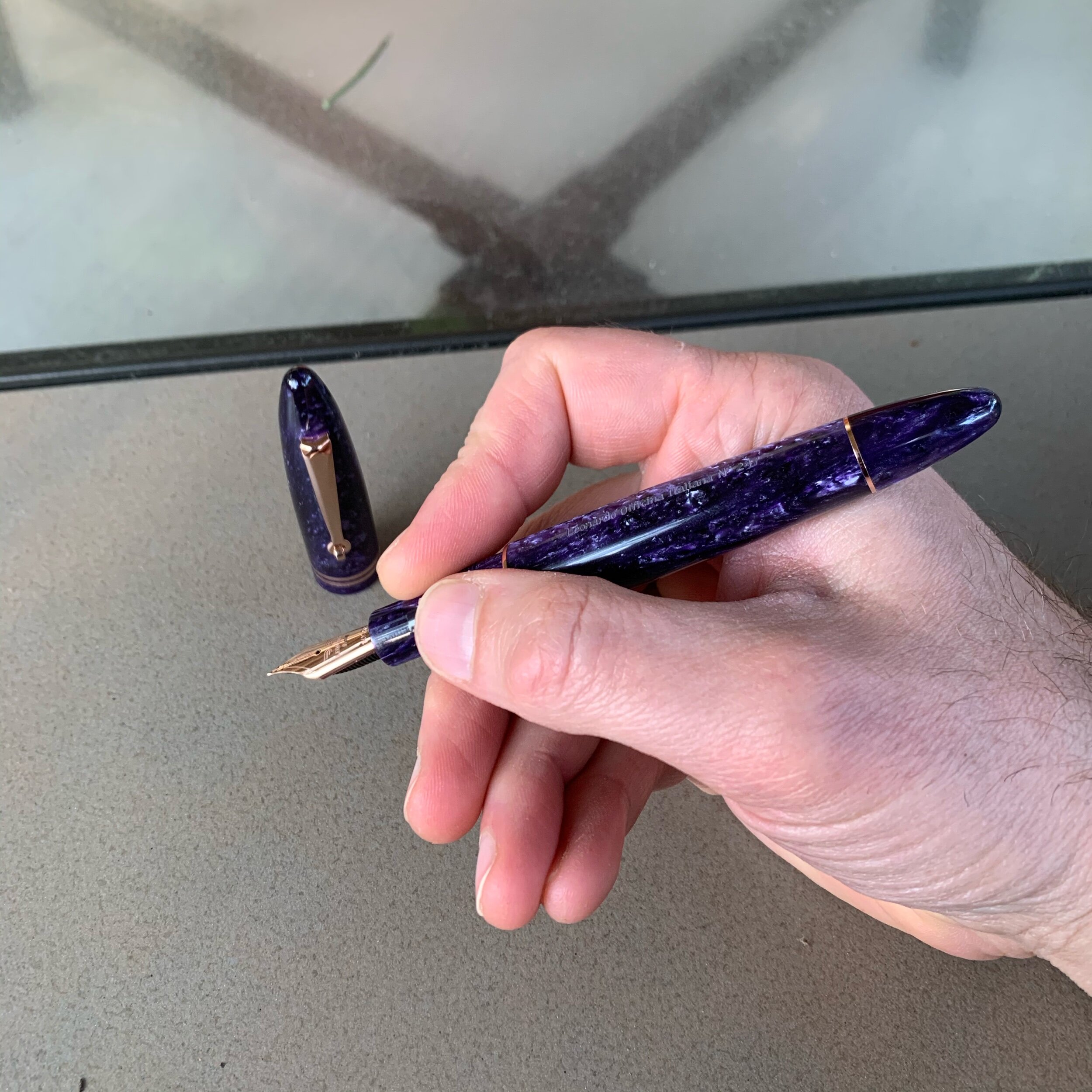
I’m not sure whether the “Deep Purple” Furore is a limited edition, but my pen is numbered.

Where the Momento Zero incorporates a wide range of acrylics and other materials in patterns reminiscent of vintage celluloid, the Furore line comes in solid colors inspired by landscapes along the Amalfi Coast. Leonardo has chosen colors they characterize as “bright and strong,” and that’s a good description of the lineup, which includes: “Arancio” (orange), “Blue Emerald” (turquoise), “Blue Emerald” (a darker ocean blue), “Bronze” (pearlescent brown), “Deep Purple” (pearlescent purple, pictured here), “Grey Vulcano” (pearlescent grey), “Red Passion” (pearlescent red), “White Salt” (pearlescent white), and “Yellow Sun” (pearlescent yellow). Most colors are available with either gold or rhodium trim, and the Deep Purple model shown here is offered with rose gold. Since I’m trying to reduce the total number of pens that I own at any given time, my goal is to limit myself to a single Furore, but as with the Momento Zero, it’s going to be hard. 

View fullsize Leonardo Furore Unposted
View fullsize Leonardo Furore Posted

As I’ve said before about many other vintage-inspired fountain pen designs, there’s a good reason these particular shapes have withstood the test of time and continue to appear on pens nearly a century later. Both the Momento Zero and the Furore are insanely comfortable pens to use, posted or unposted. I love the fact that the caps post deeply, allowing Leonardo to make a larger pen that you can use unposted, but that we “posters” can still use in our preferred way without adding excess length or throwing off the balance. 

The Leonardo Furore uses the same filling system as the Momento Zero: a threaded converter that can be used in the traditional manner or “piston style” by removing the blind cap.

Bored with the Standard Choice Between Gold and Rhodium? Give Rose Gold A Try

Speaking frankly, I’ve been a little bored with my fountain pens. Over the past few years, I’ve fallen into a rut where I’ve accumulated a lot of pens that may not appear identical, but definitely share a common design theme. There’s nothing wrong with that - it tends to happen in collecting, especially to those who have been in a hobby for a long time and learned what they like. But the line between developing strong preferences and locking yourself into a “rut” where you stop exploring new things is fairly thin. For the longest time, I resisted picking up a rose gold pen. Now I own two. 

I knew little to nothing about rose gold as a material until recently. Rose gold derives its reddish hue from mixing pure gold with a copper and/or silver alloy, and the specific reddish tone can vary depending on the proportions used in the mix. Some rose gold trim appears almost pink, while others take on darker, more coppery hues. The rose gold used by Leonardo on my Furore leans toward the darker end of the spectrum, and accentuates the Deep Purple acrylic quite well.

Even the converter/“piston knob” is plated in the rose gold trim. I’ve previously remarked on Leonardo’s attention to detail, which continues with this pen.

Takeaways and Where to Buy

I regret waiting so long to give the Leonardo Furore an extended tryout, and purple pen fans will want to give this particular model serious consideration. For whatever reason, my perception of the Furore ended up skewed by the stock images available online, which made the Furore seem like a narrower pen than it actually is. The streamlined design turned out to be extremely comfortable posted or unposted. Most notable about this purchase for me is the fact that this Furore represents the first pen with rose gold trim in my collection, I love it, and it prompted the purchase of another rose gold pen, which you all will be seeing soon. Could rose gold be a new “thing” for me? We’ll see.

While certainly not “cheap,” Leonardo pens are notable for their relatively accessible price points: you can purchase one of their designs for as little as $160 in a standard material, which will net you an exceptional pen, and you can spend more if you desire a gold nib or aesthetic upgrades such as a rare material like Italian celluloid. I purchased this pen from site sponsor Appelboom, who carries the entire Leonardo Officina Italiana lineup, including not only the Furore but the acclaimed Momento Zero and the newly released Messenger. With a steel nib, the Furore runs 147 Euros / $163 USD, depending on the exchange rate. If you opt to upgrade to the 14k gold nib, the price jumps to 328 Euros / $365 USD. Here, the 14k nib in rose gold absolutely kills it in terms of overall finish and appearance. Personally, I find Bock gold nibs much more consistent in terms of overall performance than the standard steel. While Leonardo tunes their steel nibs, and the ones in my collection are all nice writers, I prefer the feel of the gold. 

Finally, this rose gold Furore is special for another reason: it’s the first pen chose for review by my Patreon backers. One benefit I offer to my Patreon subscribers (at the “Bespoke” and “Special Edition” tiers) is the ability to vote on reviews. The Leonardo Furore won the first poll, and I have additional content in the works based on subscriber input. Many thanks to the generous Patreon supporters who made this review possible.

Disclaimer: This post contains links to paid sponsors and affiliates. I purchased the pen featured in this review from site sponsor Appelboom, using affiliate credit generated through the Appelboom affiliate program, which is one way I support the blog.

In Pens Tags Fountain Pen, Pen Review, Leonardo Officina Italiana
Comment

The Best Truly American Pencils: New Releases from Musgrave Pencil Company

March 11, 2020

The Musgrave Pencil Company is located in Shelbyville, Tennessee (“Pencil City”), which sits just down the road from my hometown of Franklin. Several years ago I reviewed some bulk pencils I had purchased from Musgrave, and came away impressed with the quality at the price point. Musgrave, however, had not updated their website in years, and the company appeared to rely heavily on advertising and specialty pencils, as well as white labeling (i.e., making pencils for other brands). In 2018, things changed, as Musgrave hired a new marketing team and started development on a new product line. You can hear more about Musgrave’s transformation on Episode 134 of the Erasable Podcast, featuring creative directors Nicole and Tim Delger, the team behind the Musgrave rebranding.

The Musgrave Harvest 320 “Professional,” shown here atop a Write Notepads Reporter Notebook (now available in an eye-popping red). Write Notepads and Baron Fig remain my preferred paper for pencils due to the texture and slightly tactile feel.

So What’s Behind the “Heritage” Tagline?

Musgrave has been making pencils in Shelbyville since 1916, so they’ve witnessed multiple shifts in the pencil industry during their more than a century in business. These changes included the move in the 1960s-1970s from traditional Tennessee Red Cedar to California Incense Cedar, which today remains the preferred wood for making pencils (though companies have shifted to other sources as even Incense Cedar has become scarcer and more expensive). The new Musgrave website features a comprehensive company history, including a bunch of unique photos from the pre-WWII era.

Musgrave’s new “Heritage” collection is headlined by the “Tennessee Red,” made from the same Tennessee Red Cedar used in American pencil-making all those years ago. Apparently, Musgrave discovered a source for Tennessee Red Cedar slats, which they used to create these gorgeous, highly aromatic wood-grain pencils that, to me, smell like cedar should. If you’ve ever been inside a cedar closet or stuck your head inside a wooden chest made from red cedar, you’ll know which smell I’m talking about. Musgrave also updated their signature “Harvest” yellow No. 2 pencil to include a “professional” version made from Incense Cedar, and even released a “Single Barrel 106” pencil made from vintage (i.e. 1930s) Red Cedar pencil slats.

My favorite thing about the Tennessee Reds is the variation in the wood grain. And the Tri-Star logo. As a Middle Tennessee native and (mostly) lifelong resident, I’ll buy anything with the Tri-Star.

The core that Musgrave uses is perfect for my style of writing. While it’s labeled a “No. 2” (at least on the Harvest), to me it writes more like a 2B or a No. 1, my preferred grades of graphite. Both pencils have excellent point retention for graphite this dark, and while one drawback is that Musgrave’s cores can have a tendency to smudge, that’s a trade-off I’m personally happy to make.

These three Musgrave pencils all write a similarly dark line. Writing sample is on a Write Notepads Dot-Grid Spiral Notebook.

Both the Tennessee Red and the Harvest 320 Professional are “home run” products for Musgrave, and I’m ecstatic to see this iconic American company stake out a piece of today’s expanding market for high-end pencils. My sole wish would be for them to devote additional time to quality control (discussed further below) and to consider softening the hex shape, especially on the Harvest series. I mentioned in my prior review that Musgrave’s signature hexagonal pencil can be a bit uncomfortable to write with for long periods of time - those edges are sharp. I know that Musgrave is capable of smoothing things out a bit because they have made a series of extremely comfortable incense cedar pencils to accompany Write Notepads’ “In the Pines” and “Telegraph” limited edition pocket notebooks. I’d love to see them do this on a standard release, and given how much I love Musgrave’s core such a pencil would easily become my primary writer. (For some reason, probably due to the texture of the wood, the Tennessee Red feels less sharp.)

Musgrave pencils sharpen very well. The Harvest 320 is shown here with a point carved by a NUK single-stage long-point sharpener, possibly the best I’ve used, that was featured in this quarter’s C.W. Pencils Pencil Box Subscription. I hope they sell these sharpeners soon, because I want to buy a bunch!

A Note on Sharpening and Quality Control

The release of the Tennessee Red Cedar pencil has not been without minor controversy, which I feel I need to address briefly. The Musgrave website states that the supplier of the Red Cedar slats “wasn’t used to prepping slats for pencils,” and if the slats aren’t uniform, it can result in off-center cores. Musgrave’s site suggests that off-center cores are a purely aesthetic issue, but they’re not: an off-center core can affect a pencil’s ability to sharpen (though once you get them sharpened, they’re perfectly usable).

The pencil on the left had a badly off-center core, but I was still able to get it sharpened to a super-long, concave El Casco point. The Tennessee Red on the right had a centered core and sharpened just fine in the Carl Angel-5.

My entire order of 24 Tennessee Reds only contained 2 “bad” cores, and I was actually able to get both of these pencils to sharpen, though it took running them through my El Casco sharpener as both the Classroom Friendly and the KUM Masterpiece kept giving me an uneven point nearly covered by wood on one side. Personally, I think Musgrave should inspect these pencils before they ship to remove the duds. It was fairly easy for me to look at a handful and quickly spot the off-center cores. To their credit, from what I’ve heard Musgrave is more than willing to work with customers to make things right if you receive an order containing multiple unusable pencils. They have excellent customer service.

Twenty Musgrave Tennessee Reds. The controversy over “off-center cores” is somewhat overblown - of this fistful of pencils, only one is badly off-center (top center), which isn’t uncommon but when you are selling premium pencils, it’s a legitimate issue for customers.

Visit Musgrave’s New Online Shop

You can purchase the pencils featured in this review directly from Musgrave. As I mentioned above, Musgrave has redesigned their website, including their online store. While Musgrave manufactures a vast catalogue of pencils, both standard and novelty/promotional, the new retail strategy focuses on their “Heritage Collection,” such as the Tennessee Red and the Harvest 320 Professional, both of which you can purchase by the dozen, or in an engraved (and highly aromatic) red cedar box. Overall, these are excellent pencils made by a classic American stationery company, and pencils always present an opportunity to purchase quality stationery at relatively minimal cost. Both Tennessee Reds and Harvest pencils cost a whopping $9 per dozen (compared against $24.95 for a dozen Blackwings). If you’re a fan of darker pencils with an awesome story behind them, grab these now because they have received a lot of attention and I suspect there may be a run on them in the future.

Disclaimer: The products featured in this post were purchased with my own funds for my own use. I was not compensated in any way for this review. This post (and content linked to in this post) contains affiliate links and links to my own retail store.

In Pencil Review Tags Musgrave, Pencils, Best Pencils, Pencil Review
1 Comment

Pen Review: Matthew C. Martin OG1 Fountain Pen

March 8, 2020

Though I’ve attended two pen shows, I’ve purchased very few pens in 2020, including none in Baltimore. One of my stated goals for the New Year was to continue to focus on refining my collection into a more personally meaningful set of pens and to own less stuff overall. I’ve mostly managed to stick to the “plan”, but Philly got me at both the Matthew C. Martin Custom Pens and Schon DSGN tables. For today’s review, I’m going to take an in-depth look at a pen that’s become a constant travel companion over the past six weeks: the Matthew C. Martin/”MCM Pens” Original, or as Matthew calls it, the “OG1”. 

Machined metal fountain pens and I have had an inconsistent relationship over the years. I’ve owned metal pens from Karas Kustoms and Tactile Turn, as well as various Kickstarter pens, but with the sole exception of the second iteration of the Tactile Turn Gist (which is excellent), none have stuck in my rotation for a meaningful amount of time. The primary reason is weight: It’s extremely difficult to design a machined fountain pen that most people can comfortably use for long periods of time (i.e., why many people turn to fountain pens in the first place). Since nearly all of these pens feature metal grip sections, the added weight from the barrel makes the pen even more awkward to hold by increasing the probability of the pen sliding around in a sweaty hand, which will be working harder to keep the nib under control. 

Capped, the MCM Pens OG1 is roughly the same size as a Lamy 2000, and perhaps slightly more compact.

Machinist and penmaker Matthew Martin has, in my opinion, done the best job of controlling for these factors using both smaller designs and what he refers to as “weight reduction machining.” In other words, he thins the walls of the barrel and cap, resulting in pens that are exceptionally light and comfortable to use even when made from heavy metals such as copper and brass. Combining this technique with other design choices, such as his use of the grooves in the pen pictured here, reduces the weight even further. MCM titanium and zirconium pens end up being so light that it’s fair to describe them as “featherweight.” 

Build Quality 

The MCM pens OG1 is easily the best-made machined metal pen I have ever used. Period. As I noted above, Matthew’s combination of excellent design and weight-reduction techniques creates a pen that is just as, if not more, comfortable to use than many acrylic pens, and I’ve never been able to say that before. But it’s not just about utility. The artistry involved in machining the grooves in the barrel and cap makes these pens instant conversation pieces, and don’t say I didn’t warn you that it’s the type of pen that will go “walking off” an office desk. 

If you carry a grooved pen around in a pen case or a bag, it will eventually collect lint and dust. I recommend using a can of compressed air to clean it out periodically.

The pen I purchased is made from a combination of zirconium and blue anodized titanium. Matthew also machines his own clips, and recently released pens featuring exotic metals more commonly used in the knife industry, such as Mokume-gane (Japanese-style “wood grain metal).  Matthew has made knives as well, and his father is a well-known knifemaker. 

Despite its high price, zirconium pens are among my favorite. The darker tone of the zirconium pairs well with anodized materials.

Nib and Overall Writing Experience

Matthew wisely chose to use standard JoWo No. 6 nibs, meaning that those of us with larger collections can swap in favorites like the Franklin-Christoph EF SIG pictured in this review. The standard medium nib that came with this pen, however, was also well-tuned and has a place in my stash of good JoWo writers. 

Where this pen shines is comfort. In terms of length, the MCM OG1 pushes the boundaries of how short a pen I can reasonably use. The OG1 doesn’t post, and measures 4.75 inches uncapped. While the added weight of a metal pen makes the shorter body more usable for me as a daily writer, I can’t say the lack of postability is a total non-issue. For pure EDC, I’d prefer to not have to worry about keeping track of the cap, or having it roll away while writing, but that’s a design choice that I’m willing to overlook here for the unique grooved design. For my next MCM pen, however, I will likely opt for a model with a milled clip, which can act as a roll-stopper.

I recognize that the grooved design I chose won’t be comfortable for many people. Since I don’t have sensitive hands, the grooves on the barrel and ridges on the grip section don’t bother me, but others might prefer a smooth barrel and/or a different grip texture, both of which are available.

Takeaways and Where to Buy  

Since I picked up this pen at the Philadelphia Pen Show in January, it hasn’t left my pen case, and has barely left my hand. Matthew Martin represents the best of the new, emerging generation of penmakers, and his work shows a combination of creativity and technical expertise that you don’t see often, especially with someone working out of a small shop. Visiting his table has been a highlight of the past few pen shows - each time he shows up with something that pushes the envelope even further. 

As you might expect given the choice of materials, advanced machining techniques, and overall level of craftsmanship, MCM pens are not inexpensive. The blue-anodized titanium and zirconium pen featured in this review cost me $575. Currently, the least expensive model starts at $275 (for a bronze or copper pen), with pens priced as high as $1,750 for a pen made from layered zirconium and titanium with a milled zirconium clip. Matthew sells his pens directly on his website, and he mentioned in Philadelphia that he intends to increase the number of U.S. pen shows he attends as long as he can keep up inventory. Many thanks to Matthew for taking the time in Philly (both at the table, and in the evening at Ian Schon’s open house) to offer insight into his machining techniques and design theory.

Disclaimer: I purchased the pen featured in this review with my own funds, for my own personal collection.   

In Pens Tags MCM Pens, Matthew C. Martin, Machined Pens, Fountain Pen, Pen Review
Comment

A Panoramic Shot of the Ballroom on Friday, from in front of the TGS Table.

Baltimore 2020 Pen Show Recap: And It Keeps Growing!

March 4, 2020

The Baltimore-Washington International Pen Show (or “BWIPS” for short or on Instagram), has developed into one of the bigger success stories of the past few years. As the traditional pen show circuit started to become a bit tired, the Baltimore organizers decided to bet on something entirely different, with a show more focused on new attendees and building out the overall pen show experience rather than simply buying, selling, and trading. This year’s show featured a wide variety of classes and seminars running basically every hour, on topics ranging from Zentangles and Urban Sketching to Origami. There were traditional pen-related classes as well, including “Buying and Selling Pens on eBay,” “Fountain Pen 101,” and my own contribution, “Everyday Writers: Choosing The Best Tools for Home and Office.” My own class had between 15-20 attendees, the overwhelming majority of whom were attending their first pen show. (And if you’re now reading this recap, welcome to the pen community and the TGS family!)

Write Notepads was gracious enough to open the doors to their space in downtown Baltimore for an open house that several of us from the pen show attended.

This particular pen show trip also took on a graphite hue: On Friday night, I attended a live recording of the Erasable Podcast, the result of a successful Kickstarter that brought Andy, Johnny, and Tim to the Baltimore Pen Show. (You can check out my photos from Friday here.) On Saturday night, I attended an open house at the Write Notepads bindery co-sponsored by the Erasable crew.

Uh, I’m having major FOMO after missing the preorder on these beauties. I hope they do another run at some point.

The Baltimore show was also especially notable for the large number of new vendors, including small penmakers such as Latitude Pens and Ironfeather Creative. Additionally, I’ve never seen such a large concentration of nibworkers in one place - at one point there were as many as seven working the show, and while they mostly stayed busy, I heard that it was relatively easy to have work done even if you had not booked a slot ahead of time. If you were attending to purchase pens, ink, and paper, vendors such as Vanness Pens, Dromgoole’s, and The Nibsmith had you covered.

Master penmaker Dan Symonds, who previously worked for Franklin-Christoph and has taught nearly everyone how to make pens.

Latitude Pens were set up across the aisle from TGS and right next to Vanness!

The Ironfeather Creative table on Sunday. Check out the detailing!

Emma from InkyExperiments came with a full table and wall of her amazing handwriting art.

An art journal at the InkyExperiments Table.

Hugh and Karol at Kanilea Pen Company brought their usual display, including a gorgeous batch of Kilauea pens, which were the top seller.

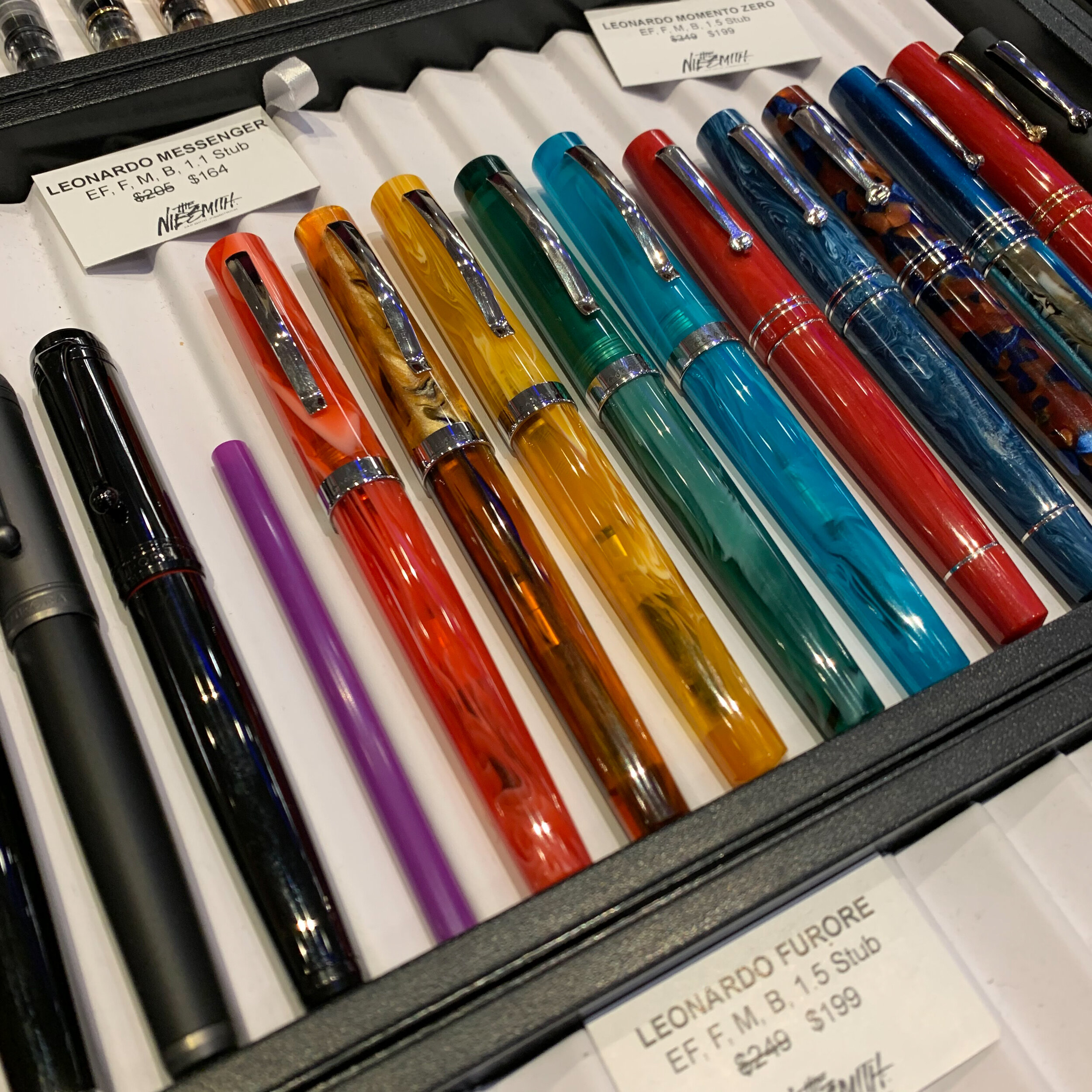
And, I was able to accomplish one of the “show goals” that I set for myself: checking out the new Leonardo “Messenger” fountain pen, which Dan Smith had at his table.

View fullsize Leonardo Messenger Fountain Pen
View fullsize Leonardo Messenger Fountain Pen Unposted
View fullsize Leonardo Messenger Fountain Pen Posted

My First Year as a Pen Show Vendor

I didn’t get to see much of the show on either Friday or Saturday, since I was behind The Gentleman Stationer table for the first time ever! While I’ve occasionally worked shows in the past for sponsors like Vanness Pens and The Nibsmith, I’ve never brought The Gentleman Stationer to a pen show as a vendor. This year, I was set up directly across the aisle from Vanness, and in addition to TGS “blog swag” and “Daily Writer” ink sample kits I put together in connection with the class I was teaching, I brought products from two brands with me to sell: Write Notepads (which is fast becoming a favorite fountain pen-friendly paper) and longtime site sponsor Pokka Pens. The response was overwhelmingly positive, and I was sold out of all my paper by early afternoon on Saturday. For those of you who asked, I now have both of these products restocked in my online store, the TGS Curated Shop.

By early afternoon on Saturday, nearly all of my Write Notepads stock and certain colors of Pokka Pens were gone.

Takeaways and Final Thoughts

Following the success of last year’s show, many speculated that Baltimore could overtake D.C. and become the premiere area pen event, if not one of the betters hows in the country. The 2020 Baltimore Pen Show has only cemented the show’s status as a “must-see” stop on the Pen Show circuit. Despite being limited to a single ballroom and a somewhat lackluster airport-Marriott location, the show punches above its weight in terms of the variety of products and vendors available, not to mention classes during the day and after-hours meetups. I would describe it as the perfect show for first-time attendees, with plenty to keep the experienced show-goer interested as well. Baltimore has earned a permanent slot in my pen show rotation.

Disclaimer: This post contains links to paid sponsors and affiliates.

In Pen Shows Tags Baltimore Pen Show 2020, Pen Show
Comment
← Newer Posts Older Posts →
Check Out Our New Online Shop!
Store Hours and Events
Updated 2026 "Best Pens" Guide
No results found
On The Paper Trail: Live In Nashville Event Tickets Now Available!
TGS_25 Roterfaden Restock Notification
Hierarchies of Fountain Pen Friendly Paper

Join Our Patreon!
Subscribe to the TGS E-mail List

Featured Posts

Featured
10-Fountain-Pens-Favorite-Inks
August 22, 2026
Three Keeper Inks: Choosing Inks for 10 Fountain Pens
August 22, 2026
Read more →
August 22, 2026
Everyday-Stationery-Bags
July 25, 2026
What's the Best Everyday Stationery Bag? My Own Considerations and 5 Options for Pen Show Season
July 25, 2026
Read more →
July 25, 2026
Graphilo-Kobeha-Paper.jpg
July 11, 2026
Paper Review: Graphilo by Kobeha
July 11, 2026
Read more →
July 11, 2026
The Gentleman Stationer RSS

© Digital Divide Media, LLC, 2014-present.

All content is the exclusive property of Digital Divide Media, LLC, d/b/a The Gentleman Stationer, including “The Gentleman Stationer” website and trademark, and should not be reproduced without express written permission.  All rights reserved.

All content containing paid advertising, affiliate links, or sponsored content will be plainly disclosed by a disclaimer when/if featured.

Contact Information

Website Terms and Conditions

Privacy Policy and Cookie Policy

Accessibility Statement

Legacy Account Login

Powered by Squarespace