• Blog
  • Shop
  • Podcast
  • Resources
  • Archive
  • FAQ
  • About
  • Contact
  • Sign In My Account
Menu

The Gentleman Stationer

  • Blog
  • Shop
  • Podcast
  • Resources
  • Archive
  • FAQ
  • About
  • Contact
  • Sign In My Account

Last Chance to Grab One: Aurora 88 Sigaro Blu

December 14, 2019

I’m in a strange place with my fountain pen hobby and with this blog. Though I’ve certainly not reviewed everything thoroughly, I’ve had the opportunity to at least write with most of the major pen brands’ flagship models. If I’m honest with myself, this realization take a little bit of the fun out of the whole experience. Things don’t feel as new, and I have to work harder to get interested in new releases, and rarely get excited about yet another Sailor Pro Gear or Aurora 88 special edition. It takes something pretty special.

These days, many so-called limited editions are basically “skins” - the exact same pen with a different barrel color or material. Sure, changing up the acrylic and trim can drastically alter the look of the pen, but it rarely changes my overall opinion on the usability or functionality of the pen. That’s why it’s uncommon for me to re-review pens based solely on changes in appearance, unless I really didn’t like the look of the pen the first time around or the company makes a particularly drastic change. For example, I recently re-reviewed the Pelikan M101N because this year’s edition spoke to me while none of the prior releases did.

In addition to a couple of modern Aurora 88s, I have one vintage pen in the black/”Nikargenta” (nickel alloy) combination.

The Aurora 88 “Sigaro Blu” represents a similar situation. I’ve reviewed the Aurora 88 in two different formats: the limited edition “Minerali” demonstrator and the blacked out “Unica Nera.” The 88 is a great pen with a classic streamlined shape that’s comfortable to use. In its current form, the Aurora 88 has been around since the 1990s, but the pen’s heritage stretches all the way back to 1947 when Aurora introduced a hooded-nib pen to compete with the Parker 51. Today the Aurora 88 is available not only in standard black and silver/gold configurations, but in a wide array of limited editions and special releases. Currently, Dan Smith has at least a dozen different versions of the Aurora 88 available for purchase.

Prior to purchasing this pen, I already knew that I liked Aurora nibs and the overall form factor of the pen, but I hadn’t found a version of the Aurora 88 that was compelling enough to boost the pen into the “daily user” category. So what drove this purchase? The lacquer finish. With the Sigaro Blu, Aurora has layered light blue streaks in a webbed pattern over black lacquer, giving the pen a blue-black or navy appearance. It’s truly distinctive, and understated in a way that’s similar to Japanese Urushi lacquerwork while still maintaining its own identity. I first had the chance to see this release in person at the 2018 Atlanta Pen Show, and since this one was an expensive purchase, I had some saving to do. Fortunately I was able to snag one at a slight discount during a year-end clearance sale at The Nibsmith.

View fullsize Aurora 88 Sigaro Blu Unposted
View fullsize Aurora 88 Sigaro Blu Posted

The “Sigaro” series of lacquer pens offers a different writing experience from the standard Aurora 88. The combination of lacquer and a metal section makes for a heavier, more front-weighted pen, and the balance feels somewhat akin to the Sailor 1911 Black Luster. It’s not a perfect comparison - the 88 is a is a piston filler, making this a more substantial, heavier pen overall, but I still have no issues using this pen all day. It will post, and since the cap has a plastic insert, I’ve not had any issues with the cap threads scratching the lacquer. (Lacquer in general is pretty durable, and I don’t worry about these things anyway. I use my pens how I want to use them, and if they start showing signs of wear that’s just part of the deal.)

The fine 18k gold nib wrote perfectly out of the box, and is paired with an ebonite feed that provides generous ink flow. Aurora nibs are made in-house, and the vast majority of my experience with the brand has been positive. These nibs aren’t glassy smooth, but they’re not scratchy either (at least to me). I enjoy the tactile feel, and by not over-smoothing Aurora tends to avoid the problems other brands have with skipping and hard-starting.

I would call this a true “Western Fine.” Ink shown here is Lamy Blue-Black, a favorite workhorse.

Takeaways and Where to Buy

I love this pen, to the point where I can say that the Aurora 88 Sigaro Blu is a “Top 5” pen for me. The pen has the perfect weight and balance for my hand, and I can comfortably use this pen posted or unposted for hours. This Aurora fine nib writes the perfect line for my daily needs in terms of width and wetness.

As I mentioned earlier, I acquired this pen from Dan Smith over at The Nibsmith, who still has Sigaro Blu pens in stock. Pricing on the Aurora 88 ranges from $495 to $905, and the Sigaro Blu sits at the highest price point. You’re paying an extra $200-300 for the lacquer work, so if the look does not appeal to you and your interest in the Aurora 88 lies elsewhere, there are plenty of lower-cost options to choose from.

Disclaimer: I purchased this pen with my own funds, for my own collection. The Nibsmith is a paid sponsor of this blog.
In Pens Tags Pen Review, Aurora, Aurora 88
Comment

Notebook Review: Filofax Notebook and Clipbook

December 11, 2019

Last week I reviewed some new products from Letts of London, and in that same shipment I received a couple of samples from Filofax, Letts’ sibling brand. I’ve been a regular Filofax user over the years - their A5 organizer was my go-to organization system through college, law school, and for the first few years of work after graduation. I fell away from the Filofax as most of my professional calendaring went digital, and my binder-style paper planner was replaced by books like the Hobonichi Techo, which I would use more as a journal.

Filofax Notebook in “Architexture” cover, A5 size.

Presumably sending shifting trends, Filofax has evolved as a company over the past decade. In addition to their classic organizers, they have launched a series of notebooks that not only feature extremely high-quality paper but are flexible in how you can use them. Taking a cue from disc-bound notebook systems such as Levenger Circa or Staples Arc, the Filofax notebooks feature “movable” pages that can be rearranged within a sturdy wire binding. The 100gsm paper feels and performs similar to Rhodia, and is available in blank, dot grid, lined, and graph rulings. The key selling point of this notebook system is its flexibility over the traditional Filofax organizer: you can certainly use it as a dated planner if you want (Filofax sells “Diary” refills), but I would envision using the included dividers as a way to organize research notes for a work project or a longer piece of writing. Since the notebook is a standard A5 size, you can use Filofax’s proprietary punch to clip in notes from your own A5 notepad. (Other sizes are available, though you’ll have to purchase A4 from Europe as it appears the U.S. store doesn’t carry it.)

For those who prefer the traditional Filofax six-ring binding, Filofax also sells the “Clipbook,” a similar product with a flexible structure but only 80gsm paper, which won’t work as well for my own personal use. While liquid ink pens such as fountain pens and rollerballs work ok, you will see some minor bleedthrough and feathering. That said, if you already have a Filofax Organizer and the “punch” accessory, you know that you can create your own paper refills using whatever paper you prefer.

Filofax Clipbook in A5. While some people might be sold on the ringed-binder system, I definitely prefer the more streamlined look of the Notebook.

The Clipbook binding will look familiar to devoted Filofax users.

While I found the 100gsm Filofax Notebook paper superb, the standard 80gsm paper in the Clipbook does not hold up as well to fountain pens.

Takeaways and Where to Buy

Of these two products, the Notebook is the clear winner for me. The 100gsm paper handles fountain pen ink quite well, and Filofax’s “movable” page system is more convenient than disc-bound notebooks, since the Filofax binding covers the back of the binding and you don’t have the discs sticking out and at risk of coming loose in your bag. Though the Filofax Notebook does not allow you to upgrade the size of the notebook by substituting in a higher-capacity binding, in my experience these sort of moveable-page notebooks become unwieldy to the point of being unusable once you pass a certain point. (It becomes nearly impossible to flip through the notebook without pages falling out.) Thus, I don’t feel that I would be losing anything by moving to the Filofax Notebooks over a Circa or an Arc, which do let you substitute in bigger discs if you need them to hold more paper.

Filofax Notebooks are available in A4, A5, Executive, Letter, and Pocket sizes, ranging from roughly $14-26, depending on size and design. The “Architexture” A5 Notebook pictured here is priced at $23.95 and comes with 56 sheets of ruled paper, four dividers and a ruler included. The Clipbook is more expensive, with the A5 version shown here priced at $29.99 and larger sizes priced at $49.99 or more. All products can be purchased directly from Filofax. For whatever reason, the 100gsm Notebook paper is less expensive than the 80gsm paper sold for the Clipbook: A5 notebook refills cost $4.99 for 32 sheets, whereas the A5 Clipbook refill costs $5.39 for 30 sheets. If you’re planning to invest in this system for the long run, however, by far the most economical choice would be to purchase a Filofax notebook punch and make your own refills.

Disclaimer: Filofax sent me the two notebooks featured in this review free of charge, for review purposes. I was not otherwise compensated for this review. Many thanks to Filofax for making this review possible.

In Notebook Review Tags Notebooks, Discbound Notebooks, Filofax, Notebook Review
Comment

Pen Review Revisited: Pelikan M101N Grey-Blue Fountain Pen

December 7, 2019

I don’t revisit reviews of specific pens very often. There are so many new releases that it’s tempting to keep plowing forward and chasing the next hot thing, even though its often equally valuable to reconsider previous opinions and see whether additional experience and changing preferences lead me to different conclusions. I need to do the latter more often, and the Pelikan M101N is a case in point.

You may recall reading my review of the Pelikan M101N “Bright Red” from June 2017. At the time, the pen didn’t speak to me, and I passed on acquiring one despite the fact that it had a lot to offer: design inspired by vintage Pelikan pens from the 1930s, Pelikan’s famed workhorse piston filling system, a gorgeous (and practical) ink window, and a 14k gold nib. I thought that the size was what held me back, but after a lot of reflection, and having the opportunity to handle other editions of the Pelikan M101N, I think it was simply because the “Bright Red” version wasn’t to my taste.

The Pelikan M101N ships with a 60ml bottle of Pelikan Royal Blue ink, complete with vintage-style label. Pelikan Royal Blue is an excellent ink for everyday writing.

I can’t say the same, however, about this year’s Pelikan M101N “Grey-Blue.” As I’ve said before, the promotional photos of this pen don’t do it justice, and it’s one that you have to see in person before making a decision on it. Not to harp on the benefits of attending pen shows, but if I hadn’t had the chance to pick up this pen at a show, I never would have considered it. The stock pics make the grey-blue material look flat, almost like the generic acrylics found in kit pens, but in person it has the same vintage-style depth as other Pelikan materials. I much prefer the palladium trim to gold.

Pelikan Nibs and the Overall Writing Experience

For the most part, the Pelikan M101N offers an excellent writing experience. It’s an extremely lightweight pen for a piston filler, and after having the chance to use the pen for a more extended period of time, I’ve come to appreciate its size. Unposted, the M101N is still a bit short for anything other than quick notes, but the posted length works perfectly well for me. Fans of the Pelikan M400 Souveran should give this pen a try, though those that find the M400 too slim will probably feel the same way about the M101N.

The nib on the M101N features “Pelikan” engraved in vintage-style script, with no logo.

If there’s one thing that’s kept me from going all-in on Pelikan over the years, it’s the nibs. I don’t dislike Pelikan nibs, but I’ve always considered them a bit “blobbish,” for lack of a better term. When I say that, I mean that Pelikan nibs contain a lot of tipping material - especially the gold nibs - which not only makes them run wider than their stated nib designation but also creates a rounded line with little line variation unless you go with a stock italic or have the nib ground. (The upside to Pelikan using a lot of tipping material is that it gives nib grinders a lot to work with, making them easier to modify, or so I’ve been told.) In my experience, Pelikan nibs write very wet and can pour a lot of ink onto the page, which amplifies the effects of the tipping. I assume Pelikan does this to achieve maximum “smoothness,” which is what luxury penmakers seem to be going for these days, and to Pelikan’s credit, they manage to do this without their nibs being plagued by skipping and babies’ bottoms from overpolishing (unlike another high-end German pen company).

Still not exactly a true “extra fine” nib, but this one writes closer to its true designation out of the box than some Pelikan nibs in my collection.

I’ve generally had better luck with Pelikan stainless steel nibs, such as those on the M120 and the M20X series, and the 14k nib on the M101N, out of the box, feels closer to that writing experience than the nib on my larger Souveran pens, such as the M400, M600, and M800, most of which I’ve had modified. I still wish that the nib on this M101N wrote a finer line for an EF, but it’s still usable for my Jibun Techo planner when paired with an appropriate ink (here, the Pelikan Royal Blue included with the M101N, complete with historical bottle).

After much consideration, the M101N posted isn’t too long. It’s actually a good length for me.

Unposted, however, the Pelikan M101N is too short for anything other than the quickest of notes.

The Pelikan sizing scale, from left: M101N, M120 Iconic Blue, M400, M600, and M800. I don’t yet have a m1000. (But maybe soon?)

Takeaways and Where to Buy

The Pelikan M101N Grey-Blue will stay in my collection for the foreseeable future. It’s compact size when capped and light weight make it an excellent choice for a shirt pocket pen, and this one has seen a lot of use at the office over the past month.

Currently, site sponsor Appelboom has a couple Grey-Blue pens in stock in the extra fine and fine nib sizes. I purchased the pen pictured here from sponsor Pen Chalet during their Fountain Pen Day clearance sale, but their prices were so good that the pen sold out quickly. Barring a clearance sale, you can find the Pelikan M101N in Grey-Blue for between $480-550, though some retailers have offered flash sales with the pen priced below the $400 mark (which is crazy and absolutely makes the pen worth it). The M101N is an expensive pen, but sits towards the lower-end of Pelikan’s special and limited edition pricing scale for gold-nib pens.

If you think the M101N Grey-Blue might interest you, I wouldn’t wait to pick one up, as the pen is already getting harder to find. Since Pelikan releases the M101N only in special edition colors, there is no “standard” version available for purchase at any given time. Pelikan typically announces the annual M101N release during the first part of the year, and stock usually lingers through Christmas, with some editions remaining available for purchase for a year or so afterward. It doesn’t look like that will be the case with the Grey-Blue, however.

Disclaimer: I purchased this pen from site sponsor Pen Chalet using affiliate credit generated through the Pen Chalet affiliate program, which is one way I support the blog and acquire products for review. This post contains affiliate links.

In Pens Tags Pelikan M101N, Pelikan, Fountain Pen, Pen Review
1 Comment

Notebook Review: Updated Notebooks from Letts of London

December 4, 2019

I have a penchant for classic stationery design. On the notebook front, any sort of leather or hard-bound notebook with gilded pages immediately gets my attention, and if the notebook is fountain pen friendly it’s a no-brainer. Letts of London - a UK stationery brand that is now under the same ownership as Filofax - has always appealed to me from a design standpoint but the lack of US availability and a reputation for simply being “ok” for fountain pens kept them off my radar.

Recently, that has changed. Letts was kind enough to reach out and send me two of their larger A5 notebooks featuring excellent 90gsm paper. This upgraded paper, available in Letts’ “Legacy” and “Icon” notebook lines, performed flawlessly, with zero bleedthrough or feathering (even with a stub nib) and good dry time. The only drawback, for some, will be that the notebooks are lined, though the ruling is narrow enough for my tendency to write small.

Letts also sent me a handful of other notebooks: a travel journal that uses the same 90gsm paper as the Legacy, and two pocket notebooks (standard and travel) which use a 3x6-ish “long and slim” format similar to the Kunisawa Find notebook that I’ve been using as my preferred pocket notebooks for the past year or so. The Letts pocket notebooks (both Legacy and Travel) only use 45gsm and 70gsm paper, respectively, so I have no expectations that fountain pens will perform perfectly, but that’s not something I necessarily look for in a pocket notebook, and in any event each comes with a slim ballpoint pen concealed in the spine of the notebook. Not only is this a clever touch from a design standpoint, but the ballpoint refill writes extremely well, and you can purchase refills directly from Letts.

I love the cream-colored paper in the Letts Legacy notebooks. You get 230+ pages, even in the pocket notebooks.

Not a hint of feathering or bleed!

Takeaways and Where to Buy

I’ve always admired the classic (and classy!) design of Letts notebooks, though I’d previously heard that their paper didn’t always play well with fountain pens. Now that Letts has introduced versions of their larger notebooks containing the heavier 90gsm paper, that’s no longer the case. The good thing about Letts, and to a lesser extent their sibling brand Filofax, is their notebooks’ relatively widespread availability at brick-and-mortar retail. I hope to see that expand in the future, especially here in the U.S.

You can purchase all of the notebooks featured in this review directly from the Letts website. The pricing is reasonable given how much paper you get, with both the larger and pocket “Legacy” notebooks running $24.99. The travel journals are priced at $16.99 for the larger notebook and $22.99 for the pocket. The price on both pocket notebooks could be a bit lower, in my opinion, given the lesser paper weight, but I assume the price also accounts for the included pen. I will reiterate that currently only the “Legacy” and “Icon” A5 notebooks feature the 90gsm fountain-pen friendly paper, while the other products contain paper ranging from 45gsm to 80gsm. Be sure to check the specifications before submitting your order, if the heaviest-grade paper is important to you.

Disclaimer: Letts sent me the notebooks featured in this review free of charge, for review purposes. I was not otherwise compensated for this review.

In Notebook Review Tags Notebooks, Letts of London, Travel Journals
1 Comment
IMG_2214.jpg

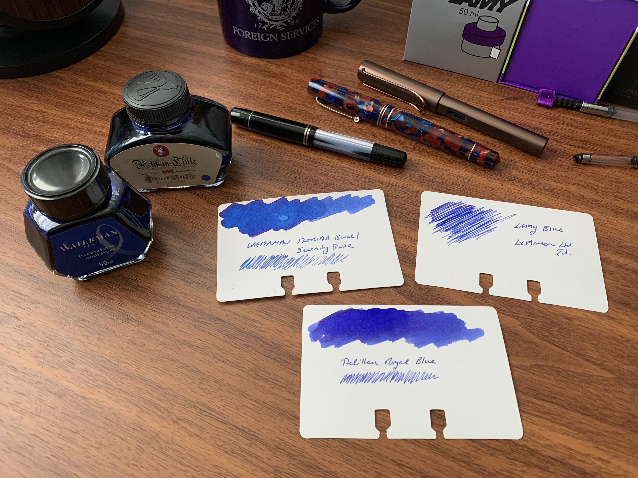
Back to Basics: Blue Ink for Everday Writing

November 27, 2019

Ten years ago, I never would have imagined the size and scope of today’s stationery marketplace, much less the depth of the community surrounding it. Indeed, there were times when I was convinced I had picked a hobby that wouldn’t even exist in ten years, much less have expanded so much. While this is mostly a good thing - and a topic I plan to explore in depth in future posts - I sometimes find myself experiencing a sense of overwhelm and paralysis-by-choice. There are simply so many different brands and models of pens, inks, pencils, and paper out there that I can only imagine how confusing it must be to someone diving in for the first time, especially when it comes to fountain pens and fountain pen ink.

In all of our enthusiasm for chasing the next hot thing, I don’t want people to lose sight of the fact that you can always go back to the basics and still have a great experience. When you just want to enjoy a long writing session with a new pen or an old favorite, sometimes the best thing you can do is stop worrying about which ink would make the “perfect pairing,” ditch chasing “shimmer” and “sheen,” and ink up a basic blue or black ink. A few weeks ago I wrote about how I’ve grown to appreciate Lamy’s standard Black and Blue-Black offerings. Not only have I continued to use those two warhorses, but I’ve reached back into my ink cabinet and pulled out a few more favorites, namely some basic blue inks.

Waterman Serenity Blue

My number one work-friendly ink of all time, Waterman “Serenity Blue” (formerly “Florida Blue”) might be the best all-around fountain pen ink ever made. That’s a pretty big claim, but it’s not hard to support. Waterman ink (1) can be found at $12 or less per bottle at retail; (2) is widely regarded as one of the safest fountain pen inks available for use in vintage pens and materials prone to staining, like celluloid; and (3) works well on nearly all types of paper, making it a versatile ink suitable for pretty much any use case. Waterman ink bottles are also extremely functional: the faceted design lets you tilt the bottle for easier filling once the ink level gets low.

Pelikan 4001 Royal Blue

Slightly darker than Waterman Serenity Blue, Pelikan 4001 Royal Blue has its own group of devotees, some of whom love this ink so much that Pelikan sells it in massive 1 liter bottles (though recently I’ve currently only been able to find this size available in Pelikan Brilliant Black in the U.S.). While I personally prefer Waterman’s brighter tone, Pelikan Royal Blue likewise performs well on most papers and is a “safe” ink to use in nearly all pens. Pelikan inks come in a wider variety of bottle sizes than Waterman, with a few more reasonable options than the liter jug: around $11 for a 30ml bottle, or $14 for a 62.5ml bottle. The “historic” bottle of Royal Blue (same ink, different packaging) is priced at $12 for 60ml.

Lamy Blue

Finally, the last of the three basic blue inks that I use on a regular basis is standard Lamy Blue. If you’ve purchased a Lamy cartridge-converter pen, you have a sample of this ink on hand, since Lamy includes a blue cartridge with every pen sold. Though I still use it fairly regularly - mainly for the convenience of cartridge form - Lamy Blue is my least favorite of the three inks discussed here. It’s less vibrant than both Waterman Serenity Blue and Pelikan Royal Blue, with a tendency to take on a washed-out tone and fade after the ink dries. What this ink does have going for it is Lamy’s excellent ink bottle (complete with blotting paper) as well as the fact that it’s erasable using one of Lamy’s Ink Eraser Pens.

Takeaways and Where to Buy

You can’t go wrong with any of these three blue inks, all of which are inexpensive, reliable, and widely available. While nothing is certain, you probably don’t have to worry about getting attached to any of these three inks, only to have the formulation change or the ink disappear from the market. Waterman, Pelikan, and Lamy inks have all been around forever and I haven’t seen any signs that is about to change.

The one drawback is impermanence: none of these inks are waterproof, so if you’re looking for that you should go elsewhere (Pilot Blue-Black is an exceptional ink with decent water resistance, also available in large quantities).

You can purchase these three inks from nearly all major pen retailers, including site sponsors Pen Chalet and Vanness Pens.

Disclaimer: This post contains links to paid sponsors and affiliates. I believe that I purchased the inks featured in this review with my own funds, for my own use, though it’s possible I used store credit generated through affiliate programs in which I participate. I’ve gone through multiple bottles of Waterman Blue over the years so I can’t be sure.

In Ink Reviews Tags Basic Inks, Blue Ink, Waterman, Pelikan, Lamy, Ink Review
5 Comments
← Newer Posts Older Posts →
Check Out Our New Online Shop!
Store Hours and Events
Updated 2026 "Best Pens" Guide
No results found
On The Paper Trail: Live In Nashville Event Tickets Now Available!
TGS_25 Roterfaden Restock Notification
Hierarchies of Fountain Pen Friendly Paper

Join Our Patreon!
Subscribe to the TGS E-mail List

Featured Posts

Featured
10-Fountain-Pens-Favorite-Inks
August 22, 2026
Three Keeper Inks: Choosing Inks for 10 Fountain Pens
August 22, 2026
Read more →
August 22, 2026
Everyday-Stationery-Bags
July 25, 2026
What's the Best Everyday Stationery Bag? My Own Considerations and 5 Options for Pen Show Season
July 25, 2026
Read more →
July 25, 2026
Graphilo-Kobeha-Paper.jpg
July 11, 2026
Paper Review: Graphilo by Kobeha
July 11, 2026
Read more →
July 11, 2026
The Gentleman Stationer RSS

© Digital Divide Media, LLC, 2014-present.

All content is the exclusive property of Digital Divide Media, LLC, d/b/a The Gentleman Stationer, including “The Gentleman Stationer” website and trademark, and should not be reproduced without express written permission.  All rights reserved.

All content containing paid advertising, affiliate links, or sponsored content will be plainly disclosed by a disclaimer when/if featured.

Contact Information

Website Terms and Conditions

Privacy Policy and Cookie Policy

Accessibility Statement

Legacy Account Login

Powered by Squarespace