• Blog
  • Shop
  • Podcast
  • Resources
  • Archive
  • FAQ
  • About
  • Contact
  • Sign In My Account
Menu

The Gentleman Stationer

  • Blog
  • Shop
  • Podcast
  • Resources
  • Archive
  • FAQ
  • About
  • Contact
  • Sign In My Account

New Notebook Alert: Yoseka Stationery

September 11, 2019

My friend Cary Yeager - of both Fountain Pen Day and Kenro fame - introduced me to this notebook at a pen show earlier this year. I can’t remember exactly which one, but I believe it was the Arkansas Pen Show in Little Rock. A few weeks later, this sample notebook showed up in the mail from Yoseka Stationery, and I have to apologize for how long it’s taken me to do a review, especially since this is such an interesting product. Cary explained to me that the owners of Yoseka Stationery had just opened a brick-and-mortar shop in Sunnyside, Queens, and had designed this notebook from scratch after sourcing the paper from Taiwan.

You can read the full description here on the Yoseka website, but in short this notebook contains 85gsm “KBU2” paper from Conifer, a Taiwanese company that has been around since 1955 and apparently experiments quite a bit with different paper properties. Yoseka chose this particular paper because “it encourages a quick dry and it perfectly reflects the sheen of the pen ink with minimal bleeding.” Since the paper is fairly absorbent, it does dry quickly, with no smearing once the ink is dry - something those who love “sheeny” inks will appreciate since many of those tend to smear even days later.

I had minor issues with bleed-through in the Yoseka notebook, but I’m beginning to suspect that the primary culprit is one particular ink (Lamy Crystal Peridot), which has been temperamental on several different papers. I experienced serious bleed-through with that ink on a Rhodia pad.

The design of the notebook itself merits some discussion. Yoseka uses a plain “cement grey cardboard hardcover”, which reminds me of the thick chipboard covers used on the Doane Paper notebooks, as well as a “naked binding” that shows off the stitching and gluing. Yoseka describes the cover and binding as “durable,” but that characterization will, of course, depend on how hard you use your notebooks. Fans of minimal design will like the look, and the binding allows the notebook to lay completely flat.

A true lay-flat binding!

Takeaways and Where to Buy

Yoseka Stationery makes a nice notebook featuring a simple design and durable construction. This notebook also contains a lot of paper, which should handle most fountain pen inks relatively well and show off any inks that sheen. I’d offer a note of caution for those who anticipate writing on both sides of the page with very wet nibs and inks, as you might experience a touch of “pinpoint” bleedthrough (pictured above). Otherwise, this notebook should meet most people’s needs, and generally has been well-received by fountain pen users.

You can purchase the Yoseka Notebook directly from Yoseka Stationery in Queens, New York, either via their online store or in person at their brick-and-mortar location in Sunnyside. It’s reasonably priced at $20, and I definitely plan to make a visit when I’m in New York City next month (along with visits to my other favorite NYC stationery shops)!

Disclaimer: The notebook featured in this review was sent to me free of charge by Yoseka Stationery. Many thanks to them for making this review possible!

In Notebook Review Tags Notebooks, Yoseka Stationery, Yoseka, Taiwanese Paper, Notebook Review
Comment

Pen Review: Karas Kustoms Vertex Fountain Pen

September 7, 2019

While I wasn’t one of the lucky ones able to snag an original Vertex prototype when Karas teased the pens late last year, I admired them from afar and have been waiting for their wider release. Earlier this summer Paul from Karas Kustoms contacted me and asked whether I would be interested in reviewing the finished product. I received for review a Vertex in limited run “Galeocerdo” acrylic, which I would describe as a multi-toned metallic silver material that I hope makes its way into regular production at some point. As for the pen itself, overall I’m impressed with what Karas has done, but the Vertex still has some issues that give me reservations about issuing an unqualified recommendation. Read on to learn more.    

As always, Karas Kustoms gets creative on their packaging. My Vertex shipped in this machined aluminum box, with a foam insert to protect the pen.

Vintage-Inspired Design and Maximum Writing Comfort

Let’s start with what I really enjoy about the Vertex: the look of this pen and how comfortable it is to use for long periods of time. Karas has carried over the vintage design aesthetic from its previous “Signature” release, the Decograph, into a shorter, chunkier pen that I prefer. (While I enjoyed testing the Decograph, over time I found the pen slightly too long posted.) The long, concave section on the Vertex is outstanding, and in addition to comfort you can modify the look of your pen by swapping in a section made from a different color acrylic. Karas sells replacement sections separately, so you can purchase more than one. 

The metallic shimmer on the Galeocerdo acrylic makes me want to see more of this material. Hopefully the initial run was not a one-off.

As an acrylic pen that uses a cartridge-converter/eyedropper filling system (more on that below), the Vertex weighs next to nothing. For me, the pen has the best balance when posted, and I happily used this pen for three full days of work drafting and annotating documents longhand. The cap posts securely, and the lack of threads on the long section makes the Vertex a great choice for those who, like me, tend to adjust their grip higher or lower as I write, and don’t always hold the pen the same way. While the section is smooth, it has enough texture to provide a good grip, and I had no issues with slippage even after long writing sessions. 

Here, you can see (1) the transparent acrylic section, which is slightly concave; (2) the ink window; and (3) the o-ring embedded in the section to prevent leaking through the front of the pen.

One interesting design choice that I ended up enjoying was the decision to make the top of the cap concave.

View fullsize Karas Kustoms Vertex Unposted
View fullsize Karas Kustoms Vertex Posted

Optimized for Eyedroppering

Karas designed the Vertex as an “eyedropper” fountain pen, meaning that the pen’s barrel can be used as an ink reservoir without resorting to a cartridge or converter. That’s both a blessing and a curse. On the plus side, used as an eyedropper, the Vertex holds a massive amount of ink so you can avoid refilling frequently. Aesthetically, filling the barrel with ink also allows the transparent section to function as an ink window, a conscious design choice and my clear preference since a visible cartridge or converter would, in my opinion, destroy the beauty of the pen. The Vertex incorporates custom fit o-rings into the barrel and section so that the pen ships “eyedropper-ready,” with no need to add silicone grease to seal the threads. The cap also features an o-ring, which creates a seal that not only keeps the cap closed or posted securely, but should prevent ink from leaking out in the event there is a spill in the cap. Which brings me to…. 

The downside of this design. The main flaw in the Vertex is that the o-ring on the interior of the cap can create pressure that draws ink out of the nib and feed when you uncap the pen. To avoid any issues, Karas recommends that you uncap the pen with the nib pointed up. I would add that you should try to uncap the pen as slowly as possible, and to avoid using the cap as a fidget toy, which I confess to sometimes doing with my slip-cap pens. But even exercising as much care as I possibly could, I still ended up with ink on the section, in the cap, and on my hands on multiple occasions, with the problem getting worse after I had transported the pen in my bag to and from the office, where changes in air temperature likely increased the tendency to burp ink. I will note this temperature issue is a problem inherent in most eyedropper fountain pens, unless they incorporate a valve or seal like those found in high-end Danitrios or on the Opus 88 line. I would not recommend using the Vertex as a “pocket” eyedropper, or in a desktop pen-holder such as the Good Made Better Penwell where the pen would stored with the nib facing down.    

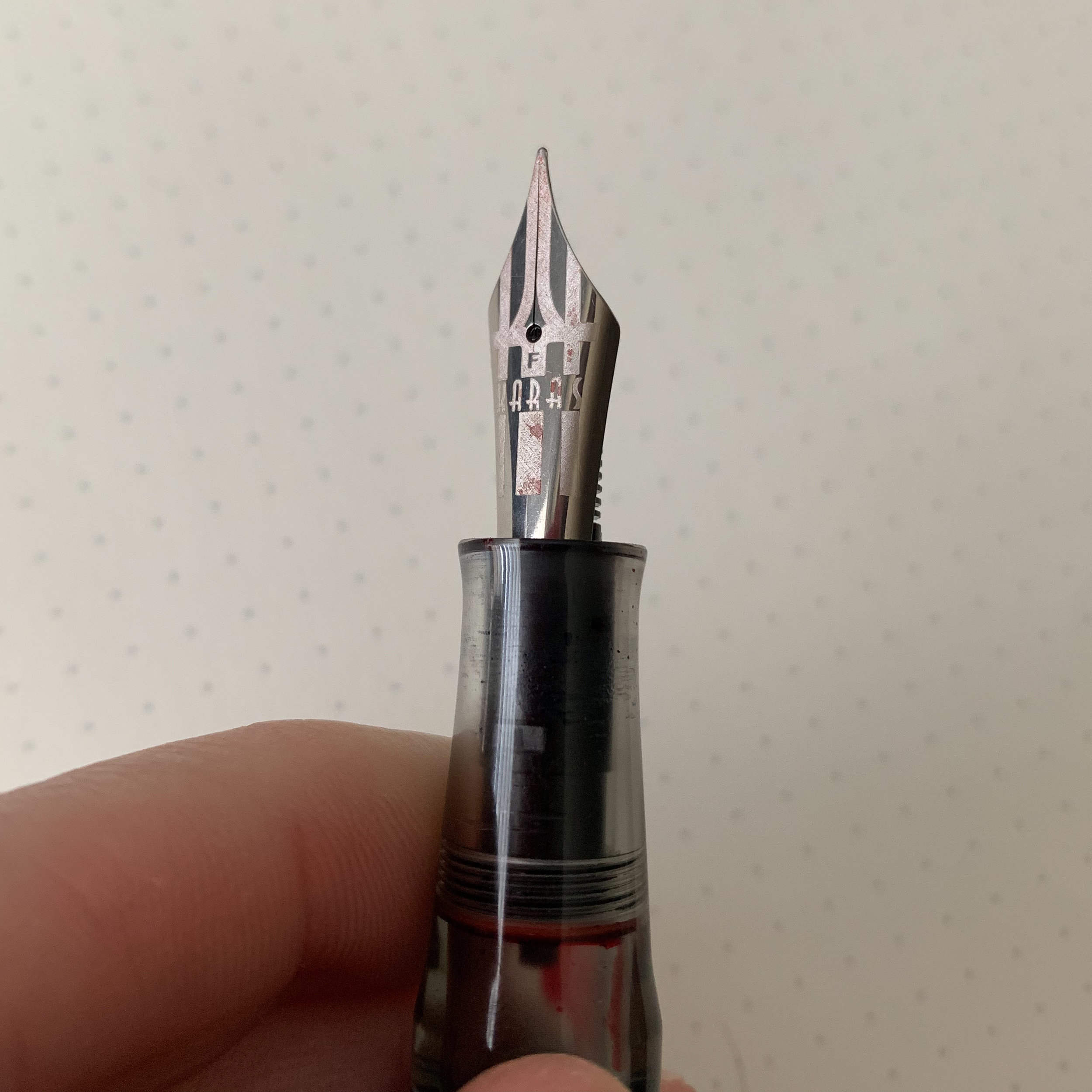
Karas Kustoms went above and beyond on the nib engraving. I love the new logo.

Karas Kustoms went above and beyond on the nib engraving. I love the new logo.

Quality Control on Bock Nibs Remains a Head-Scratcher

Karas Kustoms uses Bock nibs on the Vertex. There’s nothing wrong with Bock nibs per se. If you get a good one, they can be exceptionally nice writers. The nibs on my Conway Stewart Model 100 and both of my Faggionato pens are great examples of how a properly tuned Bock nib can equal most any other writing experience. On the other hand, however, Bock nibs are somewhat notorious for their inconsistency, and I guess I was due to take a hit after I’d had a long run of good draws. The first nib on my Vertex didn’t write at all, whether the pen was eyedroppered or whether I used the included converter. Paul quickly sent me another one - Karas customer service is excellent - and the second nib had a tendency to hard-start with a converter but wrote perfectly well when eyedroppered. The issues with the Bock nibs don’t move me one way or another on this specific pen: While I probably prefer Schmidt or JoWo, many pen brands source their nibs from Bock and unfortunately sometimes you just have to work with your retailer until you find one that’s satisfactory. A good thing about Bock nibs is that they’re easily interchangeable.     

From left, for size/shape comparison purposes: the Lamy 2000 fountain pen, the Karas Kustoms Vertex, and the Franklin-Christoph Model 20.

Takeaways and Where to Buy

I’m all-in on the direction in which Karas is moving with their pen design. I’ve thoroughly enjoyed testing out their last two “Signature” releases, the Vertex and the Decograph, and I would probably give the edge to the Vertex in terms of aesthetic design due to how comfortable this pen is in the hand and how well it posts. In their Signature line, Karas seeks to evoke the shape of classic Parker and Sheaffer pens, and the Vertex definitely has the feel of a Sheaffer Legacy or PFM. 

That said, the tendency for the Vertex to burp ink gives me pause as to whether I could use the pen as a true daily writer, which I really want to do because it’s such a comfortable pen for long sessions. I’m not sure whether anything can actually be done to mitigate the issue - it’s an eyedropper fountain pen after all, and the design of the Vertex doesn’t lend itself to easily incorporating a seal or valve. For the time being, I’m going to continue to use the Vertex and see whether the issue resolves itself as I get a better feel for how to cap/uncap the pen without causing an “inksplosion.”  

The Vertex featured in this review is the limited run “Galeocerdo” acrylic version, which is not currently available for sale on the Karas website. Production line versions of the Vertex are available in black and dark green acrylic, as well as black and white Delrin. As noted above, you can purchase different color clear acrylic sections to customize your pen, and choose from steel, titanium, and 14k gold Bock nibs. The Vertex starts at a more than reasonable $130 for a pen with a steel nib, with the price increasing if you opt for titanium or gold. (The $80 upcharge for a gold nib still allows the Vertex to remain a reasonably priced pen.)

Disclaimer: I received the pen featured in this review from Karas Kustoms, free of charge for review purposes. Many thanks to Paul and the team at Karas Kustoms for making this review possible.

In Pens Tags Karas Kustoms, Pen Review, Karas Kustoms Vertex
1 Comment

Pen Review: Aurora Vintage Duo-cart Fountain Pen

September 4, 2019

In 2017, Aurora teased a reissue of their vintage Duo-cart fountain pen, only to withdraw it from the market in order to fix some minor design flaws. While I owned one of the 2017 Duo-carts, and enjoy the pen, I held off on publishing a formal review until Aurora could perfect the design, namely the friction-fit cap which had a tendency to come loose on the original iteration of the pen. After what turned out to be a bit of a wait, Aurora re-released the Duo-cart this year as part of their “Archivi Storici” lineup, which is the name the company gives to modern versions of vintage pens reissued from the Aurora archives. The result? This one’s a hit and merits the attention of those who desire vintage style without the fuss of writing with an actual vintage pen.  

I tend to ignore packaging, but the delivery on Aurora’s “Archivi Storici” line is top notch. As shown in the “open-box” view below, you get a bottle of ink, converter, and cartridges along with your pen - everything you need to get writing straight away.

Aurora’s hooded nibs are slightly different than those on the Lamy 2000 or the Parker 51. They’re less streamlined and a bit “chunkier,” for lack of a better term. I don’t dislike the look - the Duo-cart is, and was intended to be, a workhorse pen and it looks the part.

Pros: A hooded nib and a highly usable vintage-inspired design.

What do I like about the Duo-cart? It’s a well-built modern workhorse with vintage looks. This combination of style and comfort nearly always lands a positive review here at TGS.

  • A Hooded Nib. Anytime a pen company releases a pen with a hooded nib, it catches my attention immediately. The Duo-cart’s stainless steel nib is stiff and has a touch of Aurora’s signature tooth, which makes for a tactile writing experience, without being scratchy. (It’s hard to describe, but those who have written with an Aurora pen know what I’m talking about - almost like writing with a pencil.) I would characterize the nib as a moderately wet “Western medium,” though that will vary somewhat depending on what ink you use.  

  • True Vintage Styling. In addition to the hooded nib, the Duo-cart features several other vintage-inspired design touches, drawn directly from the Aurora archives. My personal favorites include the “linear guilloche” cap, and the classic “Aurora Made in Italy” script around the base. 

  • Good Balance and All-Day Writing Comfort. What I enjoy most about the Duo-cart (as well as other vintage and vintage-inspired pens) is the fact that the pen was designed in an era when fountain pens were intended to be used as a daily writing tool akin to your keyboard. Therefore, comfort is key. The section is long and provides ample room to grip the pen, and since the Duo-cart uses a friction fit cap there are no sharp threads to interfere with your grip or dig into your hand. The pen is similar in size to the Lamy 2000 or the Parker 51.

The engraved streamline cap looks great - almost like pinstripes. With this release, Aurora introduced navy, light green, and light blue versions of the Duo-cart alongside the black and burgundy versions from the initial release. The light green (shown here) has the most “vintage” feel of any of them, in my opinion.

Cons: You can have your nib in any size you want, as long as it’s medium.

There isn’t much that I dislike about the Duo-cart, but those considering a purchase should note a couple of things: 

  • Posting. The main issue that I still have with this pen, even after the reissue, is that the cap sometimes fails to post securely. On a couple of occasions, I’ve had the posted cap go flying across my desk at work when I turned around or moved my arm suddenly. Not an issue for those who don’t post their pens, but it can be a bit of a problem for me unless I remember to jam the cap down pretty hard on the back of the barrel.

  • Nib Size. What’s the cliche? You can have it in any size you want, as long as you like medium? I imagine this choice had to do with the scale and cost of production on the hooded nib, which is specific to this pen, so Aurora went with its most popular nib option. My two Duo-carts are somewhat wet writers, so those looking for a fine or extra-fine line will probably need to invest in a nib grind.   

In keeping with its name, the Aurora Duo-cart uses a cartridge-converter filling system.

View fullsize Aurora Duo-cart Unposted
View fullsize Aurora Duo-cart posted

Takeaways and Where to Buy

The Duo-cart is my first foray into Aurora’s “Archivi Storici” editions, and given how much I’ve enjoyed this pen I look forward to more of these releases in the future. (I also plan to dig around on eBay and see if I can unearth some of the previous Archivi Storici editions, which include a re-release of the vintage-style Aurora 88.) I support pen companies reissuing modern versions of their vintage pen designs, since it caters to those of us who appreciate the classic fountain pen styles, yet don’t necessarily want to deal with using a higher-maintenance vintage pen on a daily basis.

You can purchase the Aurora Duo-cart at most Aurora retailers, including our site sponsor Pen Chalet. Aurora has set MSRP at $195 for this pen, with most retailers pricing it around $156. I don’t have any issues with this price point. The Duo-cart looks high-end, the pen is well-made, and you have to account for the time and expense of resurrecting a vintage pen from the archives that’s been out of production for years. The $150-200 price bracket is competitive, however, and Aurora is going nose-to-nose with other excellent steel-nib pens such as the Esterbrook Estie, the Leonardo Momento Zero, and the Pelikan M205. The Duo-cart’s hooded nib distinguishes it from these pens, but for around $20 more you can purchase the Lamy 2000, which also features a hooded nib, but in 14k gold with a piston filler. The design aesthetic is distinct enough, however, that the Duo-cart will likely carve out its own niche.

Editor’s Note: The dark teal ink shown in this writing sample is a limited edition collaboration between Pen Chalet and Colorverse, “Monsoon Storm.” This particular Colorverse ink includes two different colors, a 65ml bottle of Monsoon Storm and a 15ml bottle of an orange-gold color called “Monument Valley.” I may do a stand-alone review of both inks but since these are limited edition inks that may sell out I figured I would post the details here. Currently, this ink is listed at 30% off and on sale for $25. 

Disclaimer: This post contains links to paid sponsors and affiliates. I acquired this pen using store credit generated through my participation in Pen Chalet’s affiliate program.

In Pens Tags Aurora Archivi Storici, Aurora Duo-cart, Vintage, Pen Review
Comment

Pen Rolls vs. Pen Cases: A Review of the Rickshaw Bagworks Deluxe 6 Pen Roll

August 31, 2019

Up until this past year, I was firmly in the “pen case” camp. While I had a few fabric pen wraps, most were handmade, small batch products made by friends and acquaintances that I used to transport un-inked pens to local pen meets and pen shows. For casual carry these are fine, but they don’t offer enough protection for the rigors of everyday commuting, especially when the pens are sitting in my bag with a laptop, briefcase, binders, and who-knows-what-else.

The elastic cord (pictured here with lock) ensures that your pen roll remains closed, and allows you to roll your pens as tightly as possible both to prevent the pens from rattling around and to maximize space in your bag.

Pen wraps and rolls, however, have a couple of distinct advantages over pen cases. First, they can take up much less space in a bag. If you’re someone who regular carries five or six pens, a roll is much more compact and can slide easily into the corner of a briefcase, whereas a comparable fabric or leather pen case with hard sides and a zippered or snap closure typically takes up more space. Second, a properly designed pen roll can better protect your pens from dings and scratches, provided the interior uses a soft enough liner and leaves enough space between slots so that the pens don’t touch.

This particular Deluxe Pen Roll holds six pens, which I is Rickshaw’s typical size. On the Rickshaw website, however, you can order a custom Deluxe Pen Roll that holds 6, 8, 10, or even 12 pens, though I expect that would be quite large when closed. For that many pens, I’m probably still going with a pen case.

San Francisco-based Rickshaw Bagworks makes the best pen roll for my personal needs. Specifically, I’ve been carrying this “Deluxe” six pen roll that I picked up at the Los Angeles Pen Show in February, which is a special edition collaboration with LA-based artist Joey Feldman and retailer Vanness Pens. Rickshaw also has collaborated with Leigh Reyes on a previous edition, also sold through Vanness. These Deluxe Pen Rolls feature a durable Cordura exterior with a plush interior to protect your pens. (The liner is referred to as “Royal Plush” on the Rickshaw website, and it feels like microfleece.) I like how the Deluxe Pen Roll has an interior flap that keeps your pens from sliding out the top, and all Rickshaw pen rolls feature an elastic cord with adjustable “cord lock”, which keeps your pen roll closed much better than fabric or leather ties.

Size comparison: The Rickshaw Bagworks Deluxe Six Pen Roll next to my Galen Leather A5 Zippered Portfolio. The Pen Roll is shown here loaded with six pens.

Takeaways and Where to Buy

This year at work has been quite busy on multiple fronts, meaning that space in my briefcase is a premium. For that reason I’ve found myself carrying my Rickshaw pen roll more frequently, to the point where it’s become a fixture in my bag. I’ve even thrown Joey’s crazy art out into the center of a conference room table at work, but didn’t get any reaction. Apparently I’m no longer a novelty and people now expect these things from me. Sigh.

A shot of Joey Feldman’s artwork on the reverse side.

If you’re interested in the Joey Feldman collaboration, Vanness still has several of these limited edition Deluxe Pen Rolls in stock, along with some standard pen rolls (no interior flap) and utility pouches. Otherwise you can visit the Rickshaw Bagworks website to design your own. Prices start at $50 for the Joey Feldman/Vanness limited edition and $49 on the Rickshaw Bagworks website.

Note: For more information on large-capacity pen storage, including album-style cases and and pen display boxes, check out this post here.

Disclaimer: Vanness Pens is a sponsor of this website, and I received the Deluxe Pen Roll featured in this review at no charge. (Well, not really at “no charge,” since I paid with my own blood, sweat, and tears behind the table at the 2019 LA Pen Show. You can read about that experience here.)

In Pen Storage Tags Pen Cases, Pen Rolls, Rickshaw Bagworks, Vanness, Joey Feldman
Comment

Quest for Perfection: My Search for the Best Burgundy Ink

August 28, 2019

Out of all the colors available to me, burgundy is my favorite, and finding the “best” burgundy has become something of a personal quest. I’ve always been a fan of red ink, going all the way back to grade school when your supply list included a pack of those Papermate/Flair felt-tipped correcting pens, but sometimes bright red inks are a bit harsh on the eyes when you’re staring at a full page of writing. That’s where burgundies really shine.

Burgundy ink lends your writing a touch of sophistication, and if your job involves lots of annotation and marking up documents, burgundy ink is a - how shall we put it - “gentler” way to correct the ways of others, as opposed to a sea of bright fire-engine red. The color is much more muted while still remaining interesting. I’ve always thought that burgundy looks especially good in a stub or cursive italic nib, two grinds that I favor.

So What Burgundy Inks Have I Been Writing with Lately?

A current favorite Monteverde Passion Burgundy. Many people write off Monteverde as a brand that makes pens of middling quality, but don’t overlook their inks, which are reasonably priced and come in a wide array of colors. Passion Burgundy has more red to it than other burgundies which can have purple or brownish tinges, especially those inks that try to pull off a “wine” theme. Passion Burgundy also behaves fairly well on most papers, even in wet stub nibs, and Monteverde inks in general behave quite similarly to much more expensive inks produced by a certain German brand that also makes their inks in Austria. Hmmm…..

Out of these inks, I would rank my favorites as follows: (1) Montblanc Bordeaux; (2) Monteverde Passion Burgundy; (3) Montblanc Encre du Desert Le Petit Prince (4) Diamine Burgundy Royale; (5) Montblanc Burgundy Red; and (6) Private Reserve Burgundy Mist. All of these inks are excellent, and lean towards the red end of the spectrum rather than

I also recently re-reviewed Private Reserve Burgundy Mist, which was an old favorite before Private Reserve started having quality-control issues, which have since been resolved by a change in ownership and reformulations of certain colors. Burgundy Mist is a bit more “wine-y” than Passion Burgundy, meaning that you will see more purplish hues, but I’d still call it a “red.” Another relatively inexpensive choice that is closer to Passion Burgundy in color is Diamine Burgundy Royale, from the 150th Anniversary lineup.

Finally, the “classic” burgundies that periodically make their way into my rotation include Montblanc Burgundy Red and the classic Montblanc Bordeaux (now discontinued but still a great color). The standard Montblanc Burgundy works well in a finer nib but can appear a bit washed out in a stub. Montblanc Bordeaux was the perfect shade for me, and a relatively close approximation, though maybe slightly darker, is Montblanc’s Encre du Desert, one of the special edition inks released as part of its Le Petit Prince lineup. Unfortunately both the Bordeaux and Encre du Desert are not readily available.

All of the inks pictured here are “good” inks. Given that I have so many burgundies, including some that are very close approximations of each other and behave similarly, I likely will be thinning out this accumulation at some point in the future. On the whole, Monteverde and Diamine offer the best value by far, along with a steady track record of producing quality inks that won’t harm your pens.

Disclaimer: This post contains links to paid sponsors and affiliates. I can’t remember exactly how I acquired all of the ink featured here in this review, since I’ve owned much of it for years, but you can assume that I received some bottles for review purposes, free of charge, while I purchased others with my own money.

In Ink Reviews, Editorial Tags Burgundy Ink, Red Inks, Favorites, Editorial, Ink Review
3 Comments
← Newer Posts Older Posts →
Check Out Our New Online Shop!
Store Hours and Events
Updated 2026 "Best Pens" Guide
No results found
On The Paper Trail: Live In Nashville Event Tickets Now Available!
TGS_25 Roterfaden Restock Notification
Hierarchies of Fountain Pen Friendly Paper

Join Our Patreon!
Subscribe to the TGS E-mail List

Featured Posts

Featured
10-Fountain-Pens-Favorite-Inks
August 22, 2026
Three Keeper Inks: Choosing Inks for 10 Fountain Pens
August 22, 2026
Read more →
August 22, 2026
Everyday-Stationery-Bags
July 25, 2026
What's the Best Everyday Stationery Bag? My Own Considerations and 5 Options for Pen Show Season
July 25, 2026
Read more →
July 25, 2026
Graphilo-Kobeha-Paper.jpg
July 11, 2026
Paper Review: Graphilo by Kobeha
July 11, 2026
Read more →
July 11, 2026
The Gentleman Stationer RSS

© Digital Divide Media, LLC, 2014-present.

All content is the exclusive property of Digital Divide Media, LLC, d/b/a The Gentleman Stationer, including “The Gentleman Stationer” website and trademark, and should not be reproduced without express written permission.  All rights reserved.

All content containing paid advertising, affiliate links, or sponsored content will be plainly disclosed by a disclaimer when/if featured.

Contact Information

Website Terms and Conditions

Privacy Policy and Cookie Policy

Accessibility Statement

Legacy Account Login

Powered by Squarespace